A Visual Guide To Power Apps Containers
Containers are a useful way to create layouts in Power Apps. I include them in all my of my apps now but at first I totally ignored them. Why? When Power Apps containers were released much of the hype around them was their ability to create responsive layouts. It distracted me from their true purpose: to help build layouts whether-or-not an app is responsive. Now that I know how to use containers, I can’t live without them. In this article I will show you how to use Power Apps Containers.
Why Use Containers?
Containers make it easier to design the layout of an app. When a control (e.g. a button) is placed inside of a container it becomes automatically positioned. It removes the error-prone positioning of drag-and-drop and the tedious nature of manually writing X & Y position properties for individual controls. Using containers will help you create pixel-perfect apps designs more quickly.
Container Types
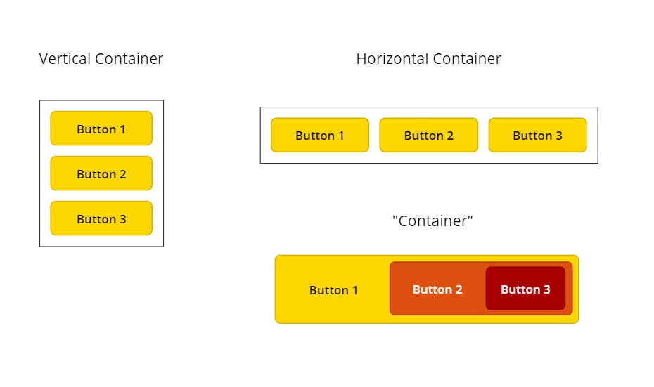
There are 3 types of containers:
- Vertical Container: this container stacks controls up-and-down
- Horizontal Container: this container positions controls side-by-side from left-to-right
- “Container”: this container allows controls to be positioned on top of one another.
Vertical Container & Horizontal Container Properties
These properties are set at the container level (as opposed to being set on individual controls within the container).
Direction Property
Direction determines the orientation of items inside a container. A vertical container is set to vertical default whereas a horizontal container is set to horizontal. This would appear to be obvious but it should be noted that a container can change its direction at any time. A vertical container can become a horizontal container and vice versa.
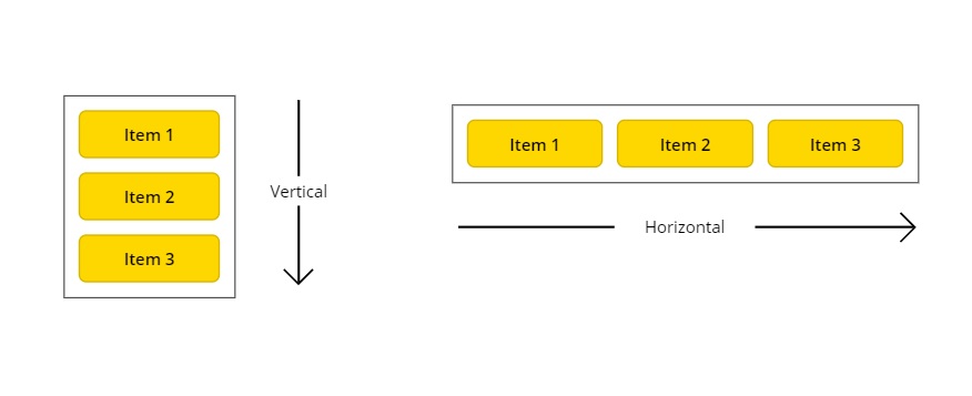
A vertical container can be used to quickly create a contact card with labels stacked on top of each other whereas a horizontal container is helpful when putting together a grouped row of buttons.

Justify Property
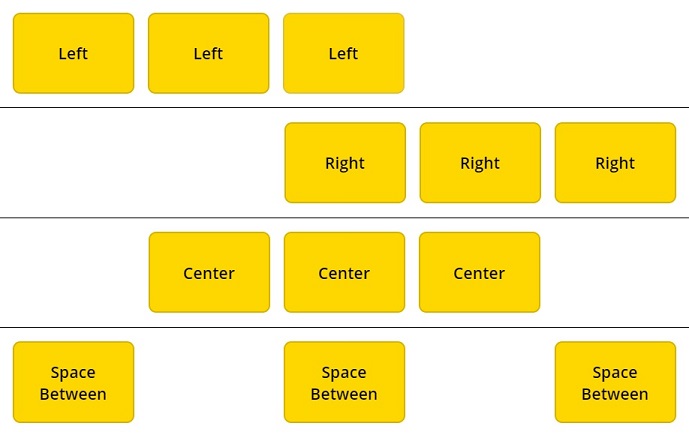
Justify sets the position of controls inside a container along the primary axis. For a horizontal container the primary axis is left-to-right. There are four options to justify a container’s contents: left, center, right and space between. Space between positions controls with an equal space between them.
These top navigation menu examples rely on the justify property to display icons on the desired side. They are made with an alternating set of icons and labels.

Align Property
Align sets the position of controls inside a container along the secondary axis. For a horizontal container the secondary axis is up-and-down. There are four options to justify a container’s contents: start, center, end and stretch. Stretch makes the control fill the entire height of the container.
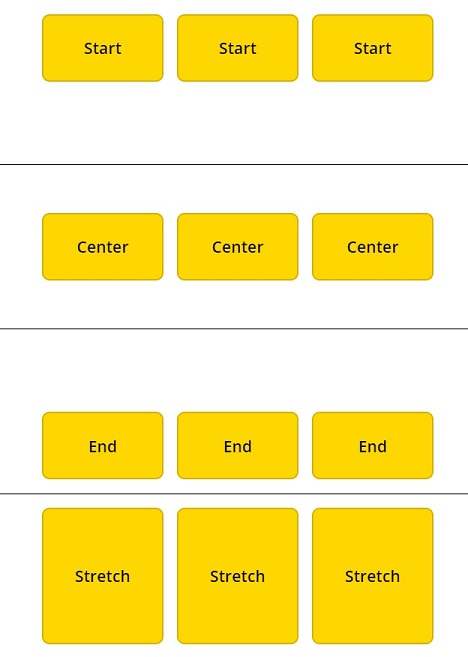
This title bar uses End for its align property to position its label and icons along the bottom of the container. Leaving space at the top is desirable for iPhones which have a camera notch there.

Gap Property
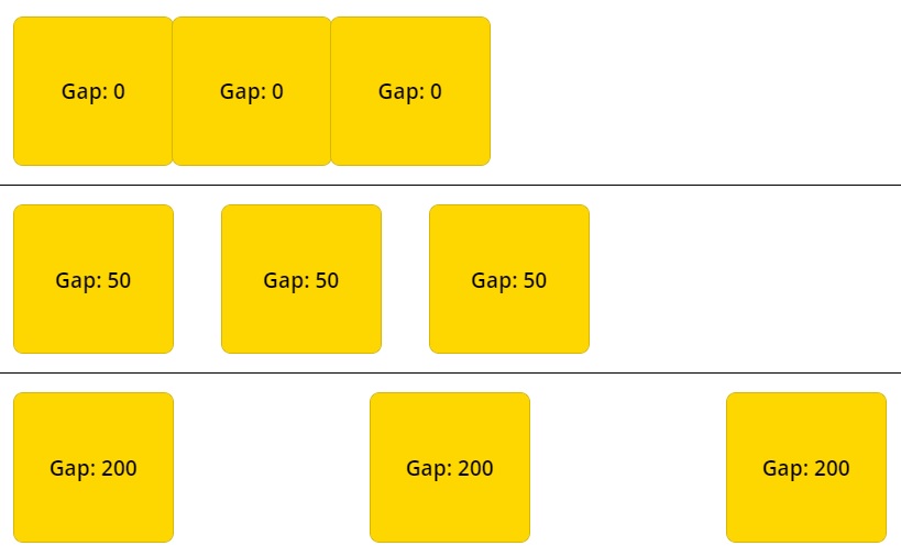
Gap determines the distance between controls. When the gap is equal to 0 controls have no space between them. As the value of gap increases controls become farther apart
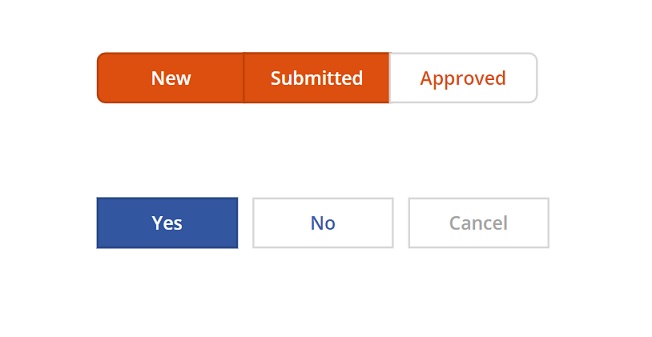
The orange row of grouped buttons have a gap of 0 whereas the blue row of separated buttons have a gap of 20.
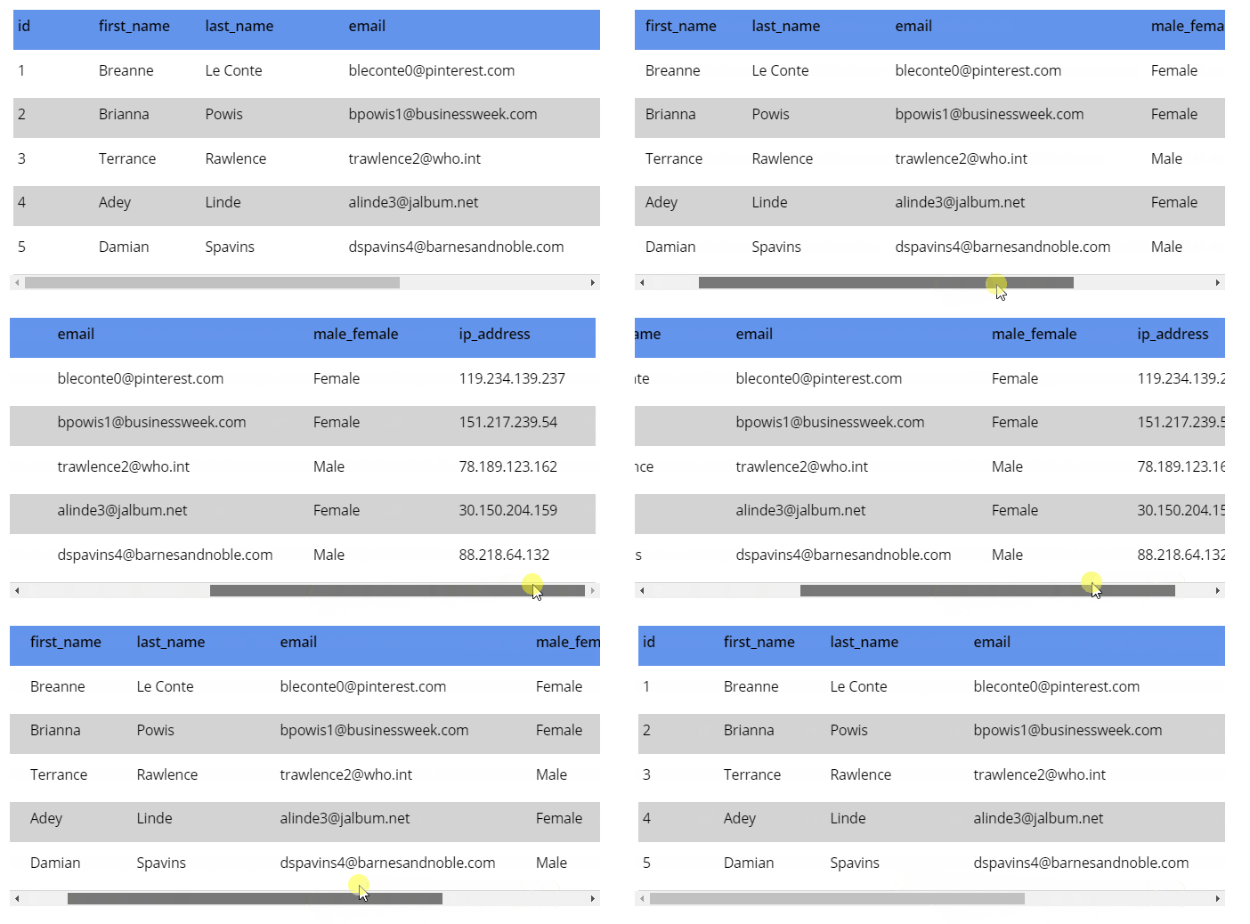
Overflow Property
Overflow defines what happens when the contents of the container exceed the size of the container. There are two options: Hide and Scroll. Hide does not show any content beyond the limits of the container.

Scroll allows the user to browse past the limits of the container using a scrollbar.
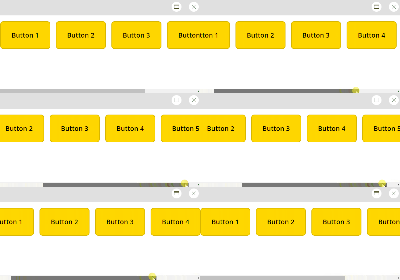
Large galleries of data with many columns sometimes extend beyond the screen. A container with the scroll property lets the user navigate to the data they need.
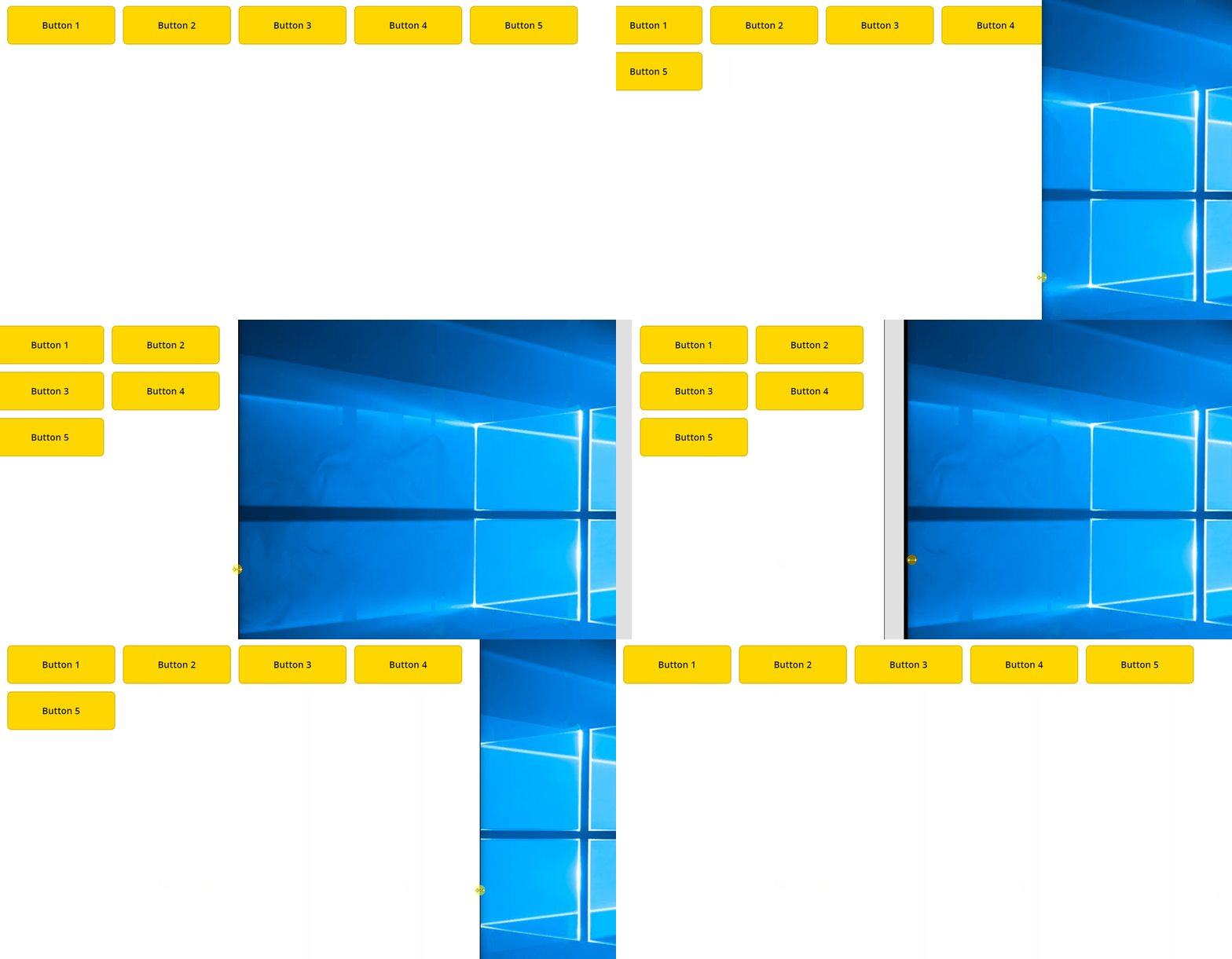
Wrap Property
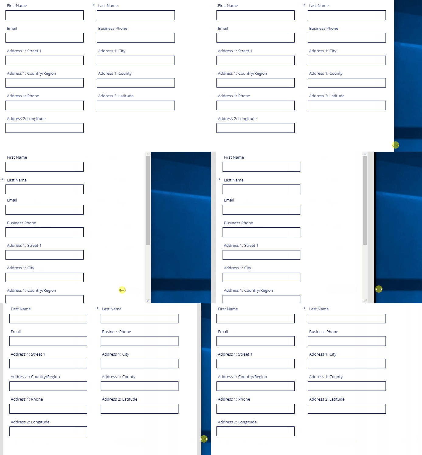
Wrap positions controls on the next line when the container is smaller than its contents. It is useful when used with responsive apps that must be displayed on devices with various sizes.
With the wrap property forms can be made to show two columns on wider devices and one column on narrower devices.
Vertical & Horizontal Container Child Properties
These properties are set on individual controls inside a container rather than the container itself.
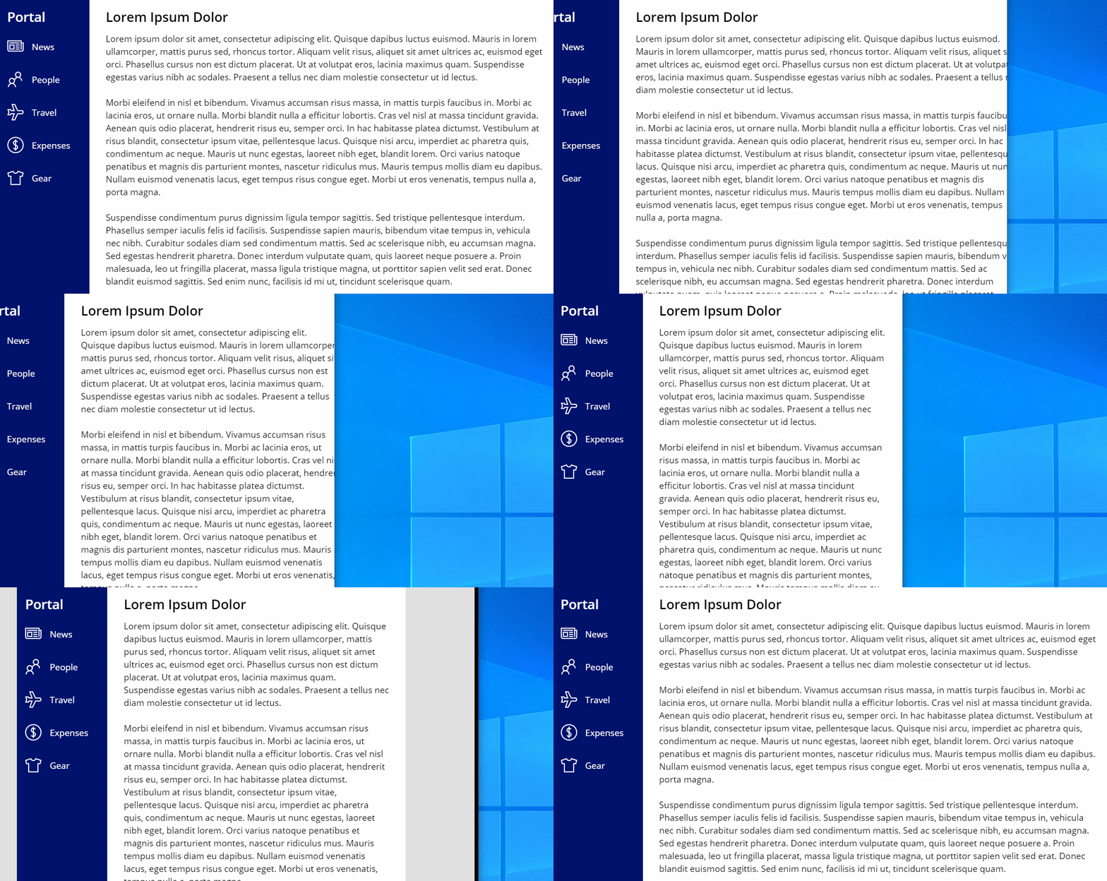
Flexible Width/Flexible Height Property
Flexible Width/Height sets the position of controls inside a container along the primary axis. Again, this property.

This company portal app has a sidebar with a minimum width of 220 pixels whereas the body of the app has a flexible width. As the browser gets smaller the body shrinks but the sidebar does not.
Minimum Width/Minimum Height Property
Minimum width/Minimum Height defines the smallest possible size of a flexible container. The property is only available for flexible controls.

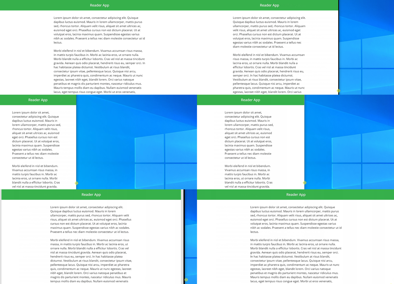
This Reader App design uses a horizontal container with 3 flexible labels. The middle label has a minimum width of 450 pixels and the left-and-right labels have a minimum width of 0.
Fill Portions Property
Fill Portions define what fraction of the screen a control takes up. Once again, the property is only available for flexible controls.
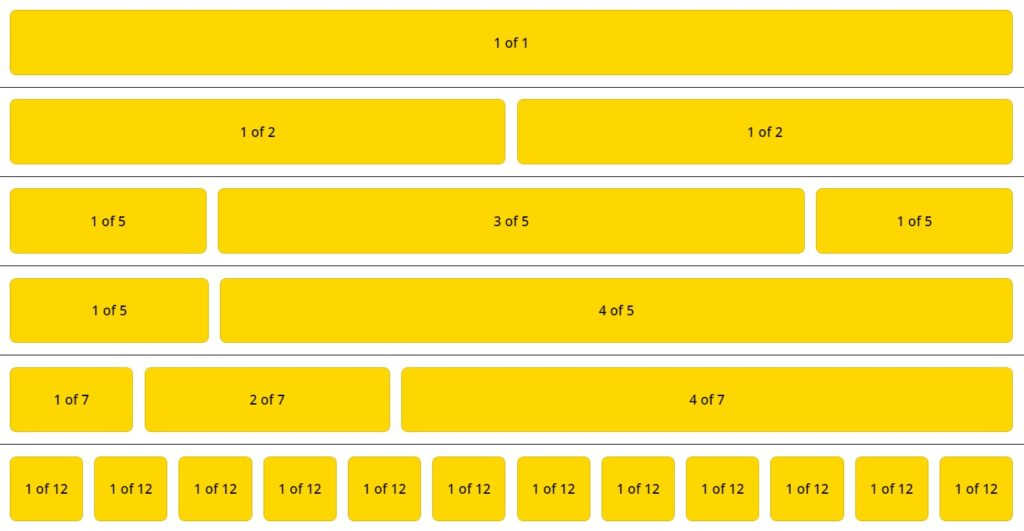
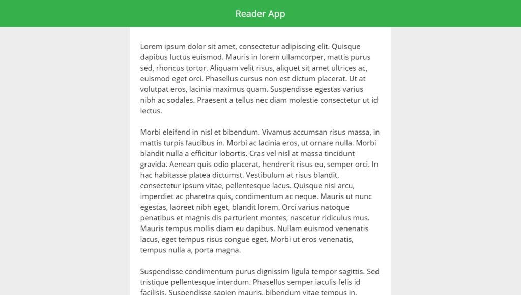
Once again, the body of the reader app has 3 labels: a middle label with fill portion of 2 and left-and-right labels each with a fill portion of 1. The middle is twice as big as the label on either side.
Did You Enjoy This Article? 😺
Subscribe to get new Copilot Studio articles sent to your inbox each week for FREE
Questions?
If you have any questions or feedback about A Visual Guide To Power Apps Containers please leave a message in the comments section below. You can post using your email address and are not required to create an account to join the discussion.


Wow!! Nice article Matthew.
Great documentations, use case and exampels. Awesome work!
Amazing. Thanks for the sharing.
Fantastic article!! Going to use containers in my latest app – thank you!!
Indeed a nice article Matthew. and I like your professional in doings things. also your cat pics all around 😀
Srinath,
Thank you. I enjoy finding the right cat picture for every article 🙂
Hi Matthew. Do you use a lot of plain containers inside of vertical and horizontal containers and then turn on wrap on the vertical or horizontal containers so that the plain containers responsively move around?
Matt,
I have done this other controls but not plain containers. That being said I think the concept would be the same. Seems like what you want to do is responsive move around some sections of the screen where you chose to float the controls, right?
Hey sir, can u make a detail about gallery with A container with the scroll property. sorry for bother
Mike,
I’m not sure I understand the question. Isn’t a container inside a gallery the same as one outside a gallery? Maybe describing your use case would be helpful to understanding your idea.
This is a great article, I can’t figure out how to move existing fields into a new container though, I can only add new controls and fields?
David,
Unfortunately, I have not encountered this issue before. My existing fields move into a new container just fine :S
Hi Matthew, thanks for the great content. Are you aware of containers making the app run slower, especially on Android or Iphone devices?
Jeff,
I do not have any evidence that containers make an app run slower on mobile, nor do I believe that to be the case. If you have a different opinion I suggest you share your findings.
Nice one Matt. Page now Bookmarked 🙂
Cheers
Thank you Mr Eales! Good to see you here.
Nice one Matt. It feels like using rows and columns in website design. One question, I will use a number of nested containers at times. Will they affect performance of the app?
Ray,
Power Apps responsive is not as smooth as web containers and the recalculation will slow down the original screen load and resizing. That being said, there’s no firm guidance on how many levels is best. I use 4 levels deep in many of my apps and it seems to work well enough.
Hello Matthew, thanks for the content. i seem to be stuck in creating a scrollable table. Can you please tell me how you made the scrollable table, what components you used in there and how?
Z,
Use this article of mine on scrolling screens for the inspiration:
https://www.matthewdevaney.com/easy-power-apps-scrollable-screen-using-a-vertical-container/
Phenomenal explanation!! I’m bookmarking your site to work with along the MS Training
Matthew,
I’m glad you enjoyed my explanation.
Hey Matt, thank you so much for yet another awesome article! I was wondering, can you describe what affects the wrap on a horizontal container? I have one that was working perfectly with 3 labels and 3 drop downs (alternating) being used as a filter. When I shrank the screen size, they dropped onto 3 rows each with label & dropdown. However, I changed something and now they’re all over the place and I can’t seem to find a definitive list of what affects the wrap of the container. I presume it’s somehow related to alignments and justifications. Wondering if you’d come across a similar scenario and knew how to work with them enough to explain it?
I want to have “containers” inside my horizontal container and no matter how i make my properties i just cant seem to get both of the “containers” to show fully. Do you have any advice?
Matt,
Have you noticed that Power Apps seems to ignore the bottom padding of the parent container when they are nested. or is it just me? I have found lately that I have to put an empty container with a height of 1 pixel to get the padding (or maybe the gap property) to actually show some blank space at the bottom of the container and not slam the last container right against the parent’s border…
This article has been super helpful when onboarding new developers to our team as are many of your other articles. I was wondering if you were aware of any performance differences when using nested responsive containers vs using formulas to set the x/y coordinates of multiple controls? I feel like the answer should be using responsive containers has better performance but don’t have any tangible evidence of this. Thanks for all your content!
Hi, I think someone copied your article: https://www.xoftsystems.com/post/unleash-the-power-of-containers-in-power-apps. I hope they had your permission to do so, but I doubt it
Marina,
I’ve asked Xoftsystems to remove the article and they immediately deleted it from their site. I don’t think anyone there knew it had been copied. Thank you for the alert 🙂