20+ More Power Apps Chart Types With QuickChart

Charts are a useful way to allow readers to quickly understand data and identify relationships/patterns. In Power Apps we only have a few chart types available (column, line, pie) and a limited set of options for styling. Often when I want to use a particular chart type its not available. With QuickChart we can extend Power Apps to use over 20 different chart types and have more choice over their appearance.
In this article I will show you how to add more Power Apps chart types by using Quickchart.
What Is The QuickChart API?
QuickChart is an API that can be used inside Power Apps to generate an image of a chart. With QuickChart there are more chart types and style options available than Power Apps very limited set.
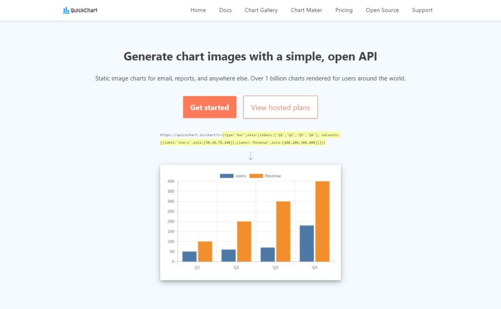
To make a chart we can place this URL in the Image property of a Power Apps image control and it will appear on the screen. The URL contains both the data to be included in the chart and information about how to format the chart.
"https://quickchart.io/chart?c={type:'bar',data:{labels:['Q1','Q2','Q3','Q4'], datasets:[{label:'Users',data:[50,60,70,180]},{label:'Revenue',data:[100,200,300,400]}]}}"Code language: JSON / JSON with Comments (json)
Power Apps only has 3 standard chart types (column, line, pie). Quickchart enables us to use all 21 chart types listed below.
| Area Chart | Doughnut Chart | QR Code |
| Bar Chart | Gauge Chart | Radar Chart |
| Box & Violin Chart | GraphViz Chart | Radar Chart |
| Bubble Chart | Line Chart | Scatter Chart |
| Clustered Bar Chart | Pie Chart | Sparkline |
| Column Chart | Polar Chart | Stacked Column Chart |
| Combo Chart | Progress Bar | Word Cloud |
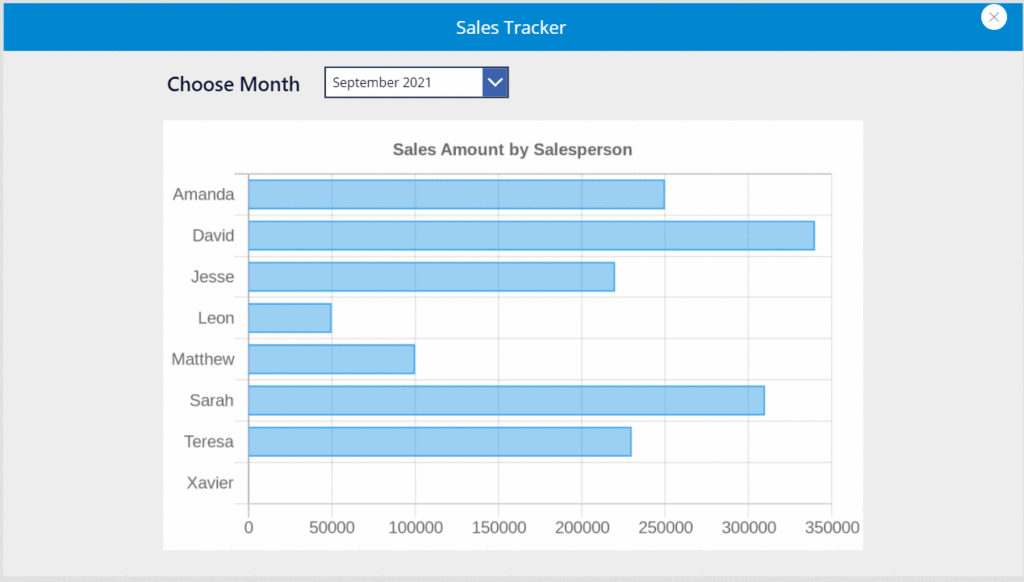
Introduction: The Sales Tracker App
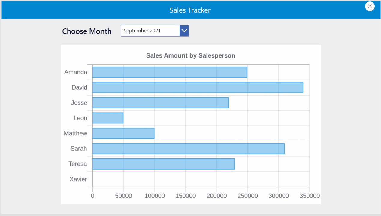
Managers at an insurance company use the Sales Tracker app to see how salespeople are performing. The Manager selects a specific month from a dropdown and a bar chart displays each salesperson’s name along with their monthly sales volume.
Setup The SharePoint List
Create a SharePoint list called Monthly Sales with the following columns:
- Salesperson (single-line text)
- Period (single-line text)
- SalesAmount (number)
Load the SharePoint list with this data:
| Salesperson | Period | SalesAmount |
| Amanda | September 2021 | 250,000 |
| David | September 2021 | 340,000 |
| Jesse | September 2021 | 220,000 |
| Leon | September 2021 | 50,000 |
| Matthew | September 2021 | 100,000 |
| Sarah | September 2021 | 310,000 |
| Teresa | September 2021 | 230,000 |
| Xavier | September 2021 | 0 |
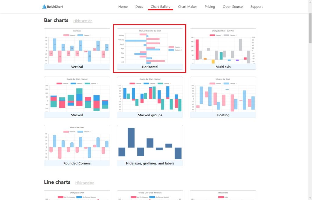
Select A Chart Type
Go to QuickChart and open the Chart Gallery page to see all the possible chart types we could add to Power Apps. Choose the Horizontal chart type.
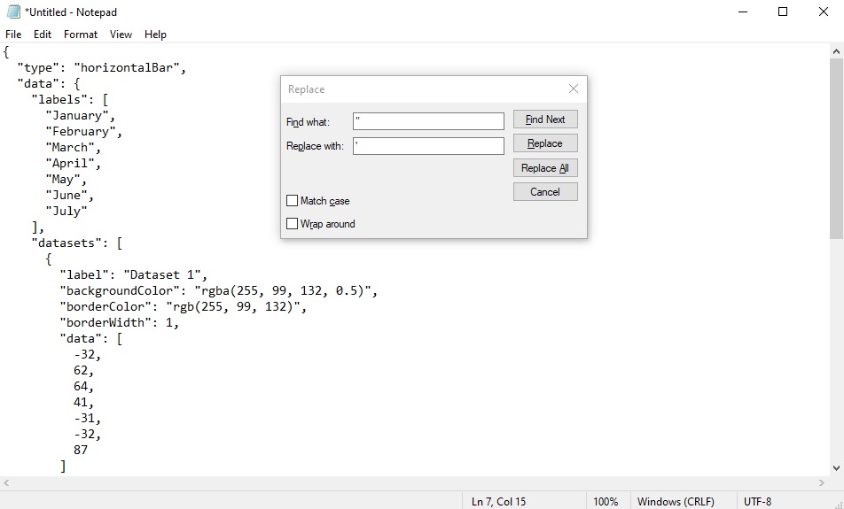
The Horizontal chart page includes a sample JSON which holds the chart information. Copy and paste this code into a text editor such as Windows Notepad.
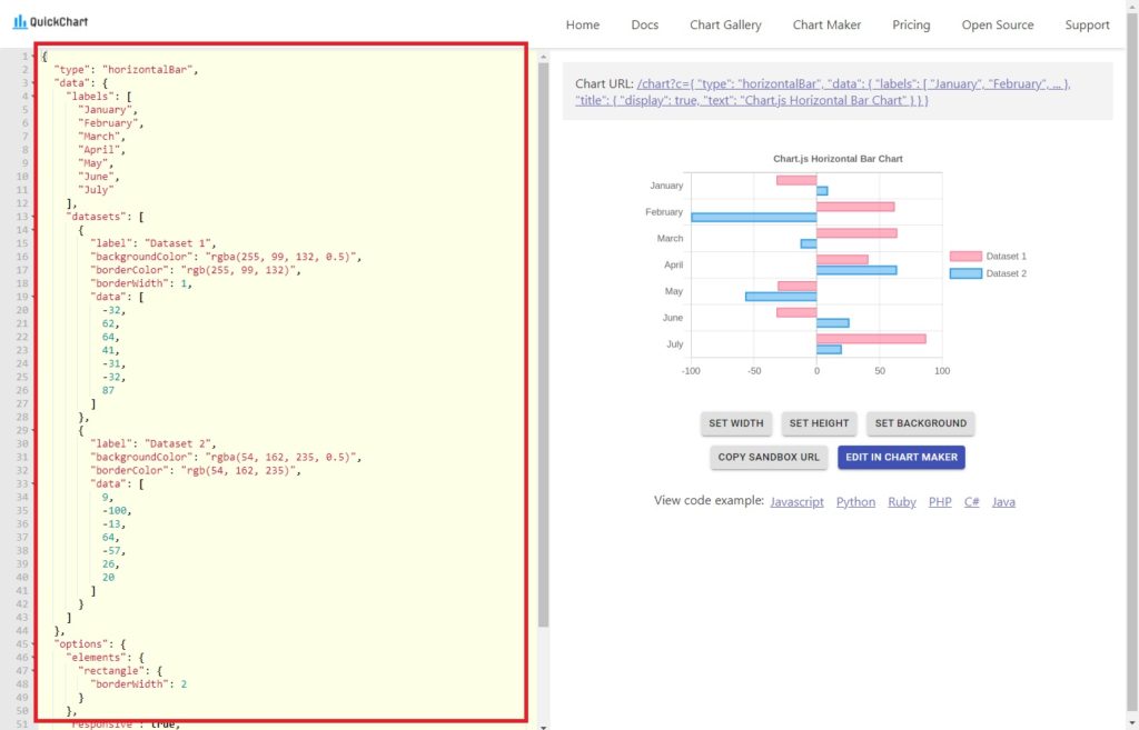
Find and replace and double-quotation marks (“) with a single-quotation mark (‘). We want to use this JSON to define the chart in Power Apps but the problem is double-quotation marks will be interpreted as a text string. Fortunately JSON treats both single-quotation marks and double-quotation marks the same way.
Generate A Chart Image
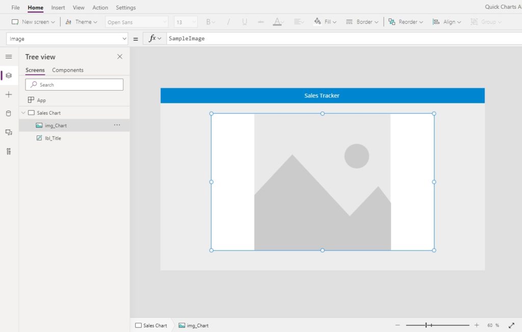
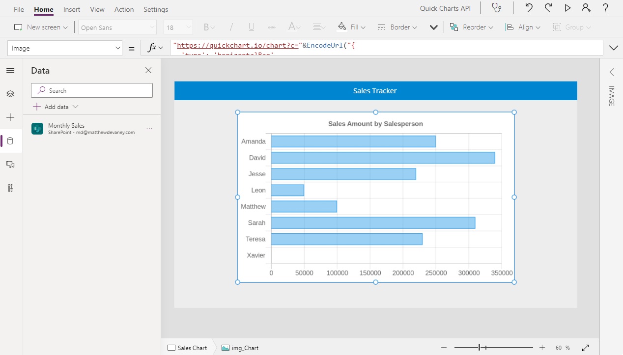
Open Power Apps Studio and create a new app from blank. Insert an Image onto the center of the screen.
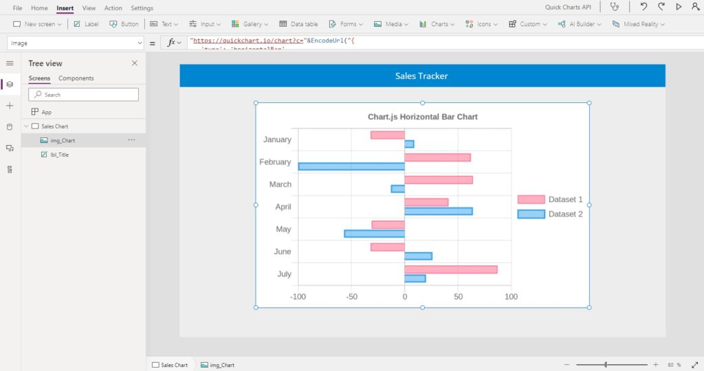
Write this code in the Image property of the Image. It is a URL containing two parts: a base URL and a JSON with the chart definition. Notice JSON code we prepared inside of our text editor is wrapped in an EncodeUrl function to replace any non-alphanumeric values into hexadecimal values that can be read inside of a web browser.
"https://quickchart.io/chart?c="&EncodeUrl("{
   'type': 'horizontalBar',
   'data': {
     'labels': [
       'January',
       'February',
       'March',
       'April',
       'May',
       'June',
       'July'
     ],
     'datasets': [
       {
         'label': 'Dataset 1',
         'backgroundColor': 'rgba(255, 99, 132, 0.5)',
         'borderColor': 'rgb(255, 99, 132)',
         'borderWidth': 1,
         'data': [
           -32,
           62,
           64,
           41,
           -31,
           -32,
           87
         ]
       },
       {
         'label': 'Dataset 2',
         'backgroundColor': 'rgba(54, 162, 235, 0.5)',
         'borderColor': 'rgb(54, 162, 235)',
         'data': [
           9,
           -100,
           -13,
           64,
           -57,
           26,
           20
         ]
       }
     ]
   },
   'options': {
     'elements': {
       'rectangle': {
         'borderWidth': 2
       }
     },
     'responsive': true,
     'legend': {
       'position': 'right'
     },
     'title': {
       'display': true,
       'text': 'Chart.js Horizontal Bar Chart'
     }
   }
 }")Code language: PHP (php)
After the code is input a sample chart will appear inside of the Image.
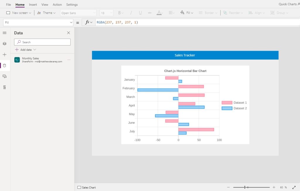
Load The Chart With SharePoint List Data
Managers at the insurance company review performance by looking at a chart showing each salesperson and their monthly sales. Our next goal is to update the sample chart with sales data. Open the data tab and add the Monthly Sales SharePoint list as a datasource.
Then go to the Image property of the sample chart and change it to this code instead. The default labels and data values have been replaced with information from the Monthly Sales SharePoint list. We use the Concat function to change the table data into a text-string so it can be passed into the URL.
"https://quickchart.io/chart?c="&EncodeUrl("{
   'type': 'horizontalBar',
   'data': {
     'labels': ["&Concat('Monthly Sales',"'"&Salesperson&"',")&"],
     'datasets': [
       {
         'label': 'Dataset 2',
         'backgroundColor': 'rgba(54, 162, 235, 0.5)',
         'borderColor': 'rgb(54, 162, 235)',
         'borderWidth': 1,
         'data': ["&Concat('Monthly Sales',"'"&SalesAmount&"',")&"]
       }
     ]
   },
   'options': {
     'elements': {
       'rectangle': {
         'borderWidth': 2
       }
     },
     'responsive': true,
     'legend': {
       'display': false
     },
     'title': {
       'display': true,
       'text': 'Sales Amount by Salesperson'
     }
   }
 }")Code language: PHP (php)
Now the chart shows our actual sales data from the SharePoint list.
Make The Chart Interactive With A Dropdown
We can further improve our app by allowing the manager to pick a month from a dropdown and having the chart update to reflect that month’s sales data. Place a new dropdown control above the chart and and label with the text “Choose Month.”
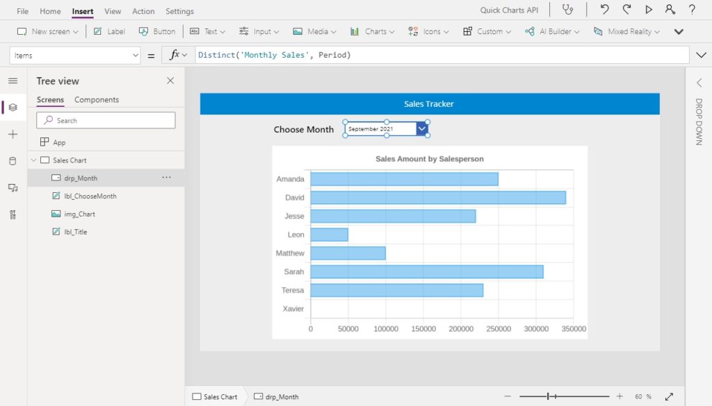
Use this code in the Items property of the dropdown to get a list of unique months/years with sales data from the Monthly Sales SharePoint list.
Distinct('Monthly Sales', Period)Code language: JavaScript (javascript)
Currently our SharePoint list contains only data for September 2021. Add this data for October 2021 and November 2021 then refresh the datasource in Power Apps. Now September 2021, October 2021 and November 2021 will appear in the dropdown.
| Salesperson | Period | SalesAmount |
| Amanda | September 2021 | 250,000 |
| David | September 2021 | 340,000 |
| Jesse | September 2021 | 220,000 |
| Leon | September 2021 | 50,000 |
| Matthew | September 2021 | 100,000 |
| Sarah | September 2021 | 310,000 |
| Teresa | September 2021 | 230,000 |
| Xavier | September 2021 | 0 |
| Amanda | October 2021 | 60,000 |
| David | October 2021 | 150,000 |
| Jesse | October 2021 | 200,000 |
| Leon | October 2021 | 260,000 |
| Matthew | October 2021 | 150,000 |
| Sarah | October 2021 | 190,000 |
| Teresa | October 2021 | 100,000 |
| Xavier | October 2021 | 0 |
| Amanda | November 2021 | 230,000 |
| David | November 2021 | 110,000 |
| Jesse | November 2021 | 210,000 |
| Leon | November 2021 | 60,000 |
| Matthew | November 2021 | 260,000 |
| Sarah | November 2021 | 160,000 |
| Teresa | November 2021 | 200,000 |
| Xavier | November 2021 | 0 |
Update the Image property of the chart image with this code. We use the Filter function to select only sales data that belongs to the selected month/year in the dropdown.
"https://quickchart.io/chart?c="&EncodeUrl("{
 'type': 'horizontalBar',
 'data': {
     'labels': ["&Concat(
         Filter('Monthly Sales', Period=drp_Month.Selected.Value),
         "'"&Salesperson&"',"
     )&"],
     'datasets': [
         {
             'label': 'Dataset 2',
             'backgroundColor': 'rgba(54, 162, 235, 0.5)',
             'borderColor': 'rgb(54, 162, 235)',
             'borderWidth': 1,
             'data': ["&Concat(
         Filter('Monthly Sales', Period=drp_Month.Selected.Value),
         "'"&SalesAmount&"',"
     )&"]
         }
     ]},
     'options': {
         'elements': {
         'rectangle': {
             'borderWidth': 2
         }
         },
         'responsive': true,
         'legend': {
         'display': false
         },
         'title': {
         'display': true,
         'text': 'Sales Amount by Salesperson'
         }
     }
 }"
 )Code language: PHP (php)
We’re done. The chart can now be controlled with a dropdown to show data for a chosen month.
Did You Enjoy This Article? 😺
Subscribe to get new Copilot Studio articles sent to your inbox each week for FREE
Questions?
If you have any questions or feedback about 20+ More Power Apps Chart Types With QuickChart please leave a message in the comments section below. You can post using your email address and are not required to create an account to join the discussion.


Amazing! Thank you!! Can’t wait to test it out, I’ll update
Shankar,
Awesome, let me know how it goes!
This is so awesome matt.
Biodun,
I think so too. Let me know what cool things you create ?
Thanks Matt.This is a wonderful thing. But I’m having problem when I try to use scatter type and connect x and y axis values with DataCardValue in powerapps form. I’m sure you have a solution for this problem. Thank you
Takbir,
Can you please provide the details needed for me to replicate your issue? I want to respond to your question but I do not have enough information to do it 🙂
Matthew, this is fantastic. If I have those 2 values within my data source, how do I assign them to the X and Y values. For example, Risk Score would be the X and Effort Score would be the Y.
“https://quickchart.io/chart?c=”&EncodeUrl(“{
‘type’: ‘scatter’,
‘data’: {
‘labels’: [“&Concat(‘Table1’,”‘”&EpicID&”‘,”)&”],
‘datasets’: [
{
‘label’: ‘Dataset 2’,
‘backgroundColor’: ‘rgba(54, 162, 235, 0.5)’,
‘borderColor’: ‘rgb(54, 162, 235)’,
‘borderWidth’: 1,
‘data’: [
{
‘x’: 10,
‘y’: 10
}
]
Terrific work! Can you do this with a collection instead of a sharepoint table?
Elbert,
Yes, you can do this with any datasource including a collection 🙂
Thanks – using a collection is working really well for me. The graphs can be fine tuned in a lot of different ways. One more question: I have the graph image file embedded in an html control and it is displayed. But when I create a pdf of the html (using a flow), the graph image doesn’t show. Do you have any advice on this?
Elbert,
There’s a video inside this blog article from my friend Paul Murana that can help you:
https://www.tachytelic.net/2021/02/how-to-generate-chart-power-automate/
Thanks – I’ll check it out!
This is just great! Can we also show the count of the records to make it more clear?
Aravind,
If you want to see the exact number of records in each bar you can add data labels using the “chart maker” at QuickChart. Is this what you wanted?
Does anyone know how to replicate this set up with the Scatter Plot diagram where it uses both an X and Y field from the data source?
I salute you sir. This is very impressive. I too am seeking to use the Scatter plot functionality to create a heat map, from a sharpoint list ( 2 columns Value & Impact, containing numeric values), but am having trouble getting the plot data (i suspect schoolboy error or stupidity on my part) any advice would be apprecited. thanks in anticipation. Andy
how can i sort this :
I´ve tried with this but is not showing any data 🙁
Hector,
Does it work for you without the sorting?
Hello, great tutorial!! I would like to know if it is possible to parameterize the way the values are displayed in this graph, the BUDGET values are displayed like this “20193234” and I want them like this “20,193,234” is it possible? “https://quickchart.io/chart?c={
type: ‘bar’,
data: {
labels: [‘ene-23′,’feb-23′,’mar-23′,’abr-23′,’may-23′,’jun-23′,’jul-23′,’ago-23′,’sep-23′,’oct-23′,’nov-23′,’dic-23’],
datasets: [
{
label: ‘PRESUPUESTO’,
backgroundColor: ‘rgba(20,193,234, 0.5)’,
borderColor: ‘rgb(20,193,234)’,
borderWidth: 1,
data: [“&Concat(‘graph’;”‘”&PRESUPUESTO&”‘,”)&”]
},
{
label: ‘PRESUPUESTO’,
backgroundColor: ‘rgba(33,71,128, 0.5)’,
borderColor: ‘rgb((33,71,128)’,
borderWidth: 1,
data: [“&Concat(‘graph’;”‘”&EJECUTADO&”‘,”)&”],
},
],
},
options: {
responsive: true,
legend: {
position: ‘top’,
},
title: {
display: true,
text: ”,
},
},
}”
Hi Matthew: Thanks again for the QuickChart introduction. Everything works great. There is one thing on which I would like your advice: I have a few charts that don’t render, as they exceed the maximum characters allowed. The QuickChart help desk suggested that I use POST from PowerApps. I am unsure how this works. Do you have any idea how to do this?
Elbert,
GET and POST are two different HTTP methods. I do not know of any way to use the POST method for QuickChart directly in Power Apps. But you can call it in the HTTP action of a Power Automate flow.
https://www.w3schools.com/tags/ref_httpmethods.asp
Ok thanks for the tip. I will try this out!
Hi Matthew, Thank you! This was a big help! All the same, I have two follw-ups:
1: Is there a place in the code to limit the Series-axis (min-max values)?
2: My chart is populated from a Sharepoint-list with 6 columns. It would be great if it was possible to visualize each column (one by one) using the same PA-screen & Chart. In your example the chart is hardcoded to one column, and the interactivity is connected to filtering of rows. Is it possible to make the chart interactive, in such a way that the user can choose the column to be displayed from a drop down?
Hallo Matthew,
ist der Service von QuickChart kostenpflichtig?
Thorsten,
Please say it in English. I do not understand this language.
OK. I still from Austria.
Is the service from QuickChart for free?
Thorsten,
At the time I wrote this article there was a free tier. Suggest you check out their pricing page to see the details.
This is awesome! I didn’t know this solution exist for 2 years, i managed to build it with a scatter chart. Is there any licensing or limitation to use QuickChart? Like there is maybe only number of times i can use the chart.
Jane,
There’s no stated limit on the pricing page. In fact it says its free with rate-limiting enforced.
https://quickchart.io/pricing/
Awesome,
But seems when my labels has a Text
The bars will not fill in?
‘labels’: [“&Concat(
Filter(MySales;MySales);
“‘”&LogText&”‘,”
)&”],
I get my data like
“LogText”;
First(Split(CODE; “- “)).Value
So it looks like
1580, 1550, 1880, BMB, TRH, 0580
any idea how i can still show the bars with value even it won’t start with a number?
Thank you
Here a sample
Hi
Anyone tried the radar graph? I am trying to see it’s possible to select records in a gallery using a check box and showing them on the radar chart – I cannot figure out how to do this and was wondering if anyone had tried?
HI Mathew i had a question about the Quick Chart IO, if i have to build a chart using the quick chart Io and using it Microsoft CRM, using the data in CRM, will all the users who view the chart-Dashboard be able to see this without the licenses can you give some insights here that the quick chart subscription is only required to develop the chart and then all the other users can use the chart with their data inset