Interactive Charts & Reports With Power BI Tiles In Power Apps

Power BI is the most popular Power Platform service and for good reason – it provides simple interactive reports and dashboards that allow organizations to understand their data. Wouldn’t it be great to extend Power Apps very limited set of charts with some of Power BI’s functionality? With Power BI tiles we can make this happen. In fact, if you already have a Power BI Pro license I believe Power BI tiles are the best option for displaying charts in Power Apps.
In this article I will show you how to use Power BI tiles in Power Apps to make interactive charts as well as show full Power BI reports inside an app.
Introduction: The Procurement Analysis App
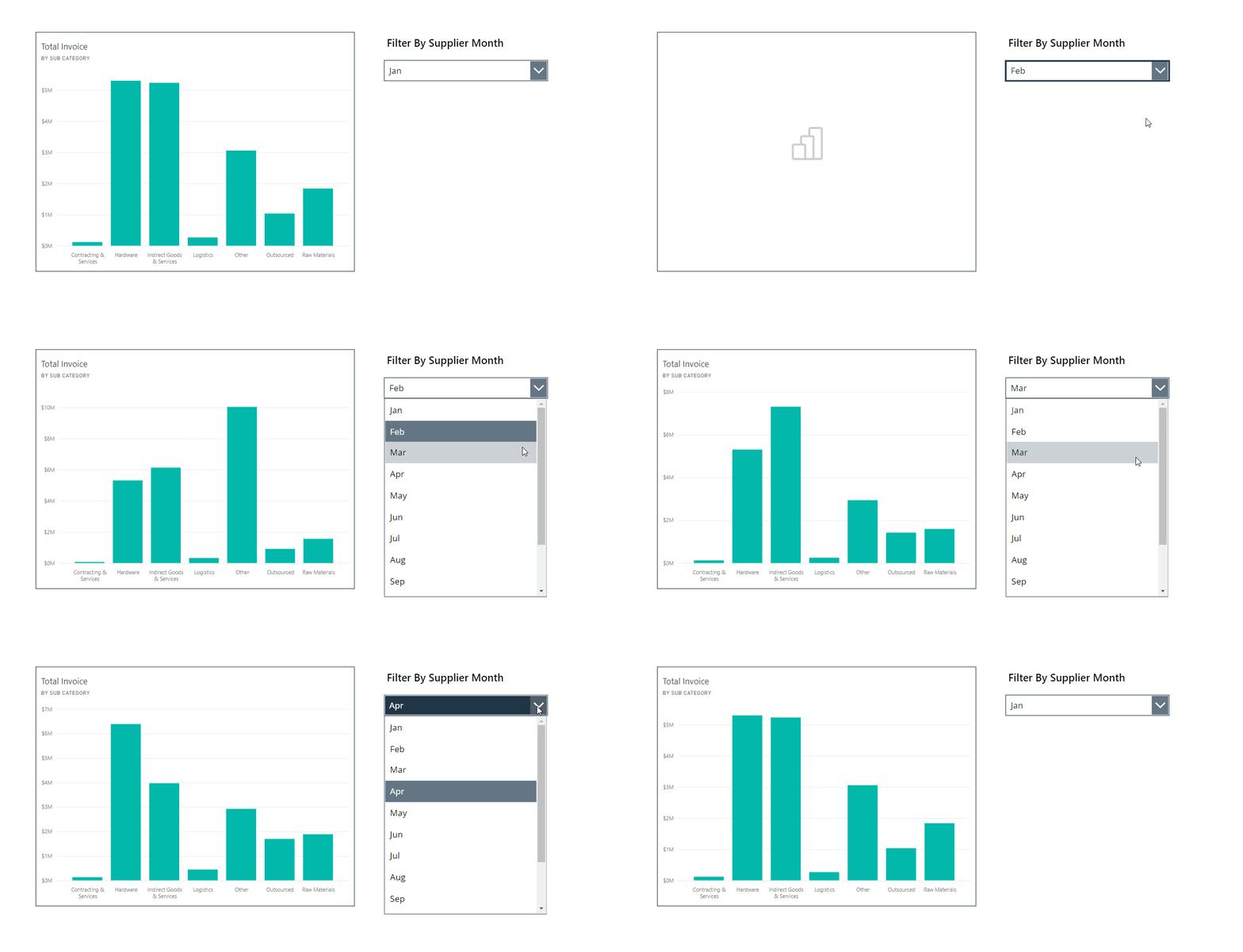
The Procurement Analysis app is used by an automobile manufacturer to analyze supplier data. Employees can view a chart showing vendor invoice totals and filter by the month.
Create A Power BI Report
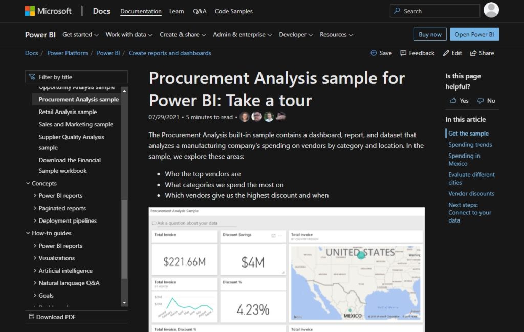
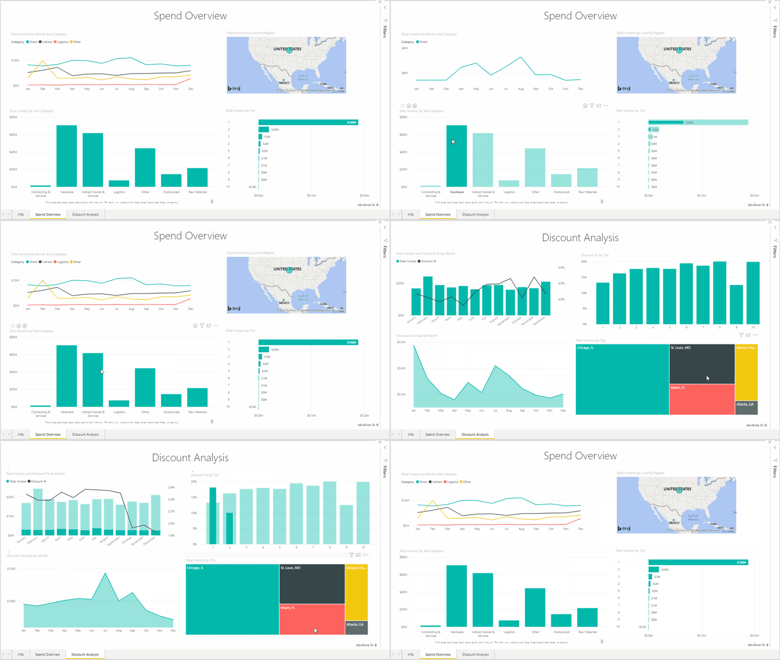
In this app we will use a sample Power BI Report from Microsoft called Procurement Analysis. You can download it for free from the Microsoft Documentation website.
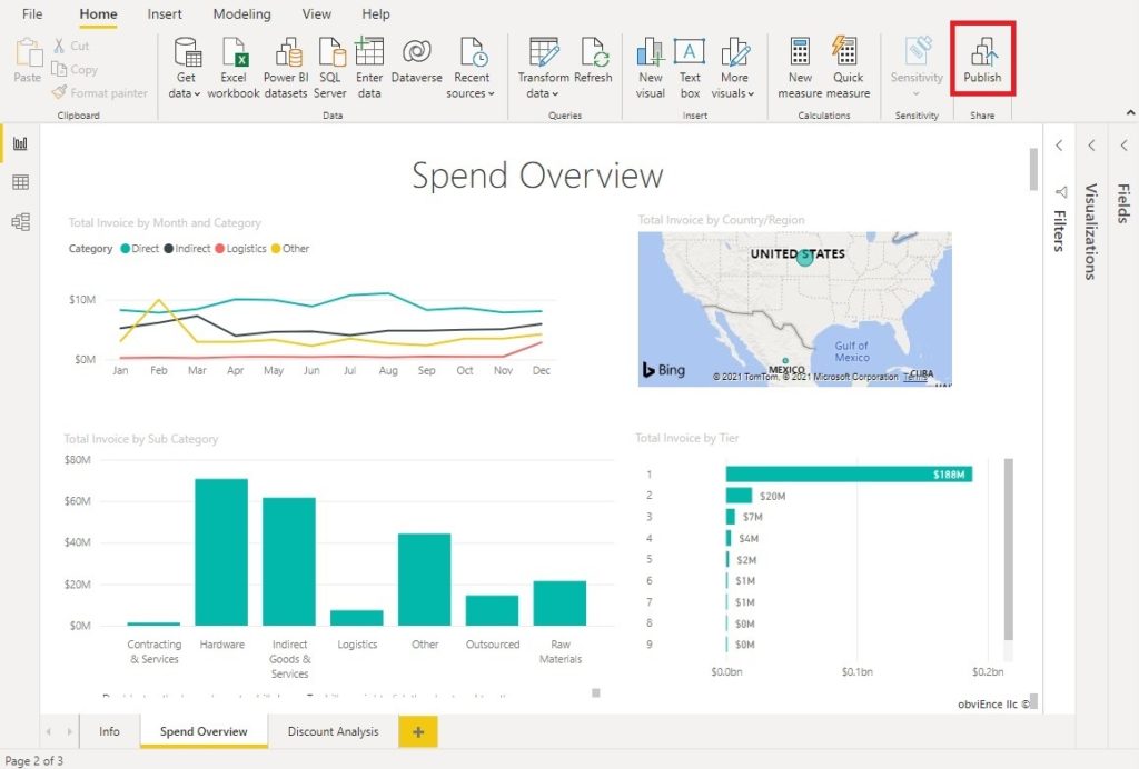
Open the report in Power BI and click the Publish button.
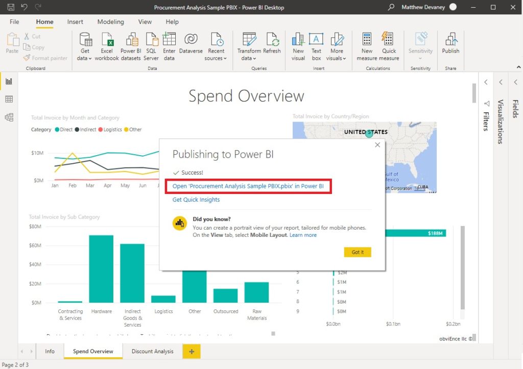
Once the Power BI report is published open it in Power BI Online.
Pin A Chart To The Dashboard
To use a Power BI chart inside of Power Apps it must be pinned to a dashboard. Select the Total Invoice By Sub Category chart and press the pin icon.
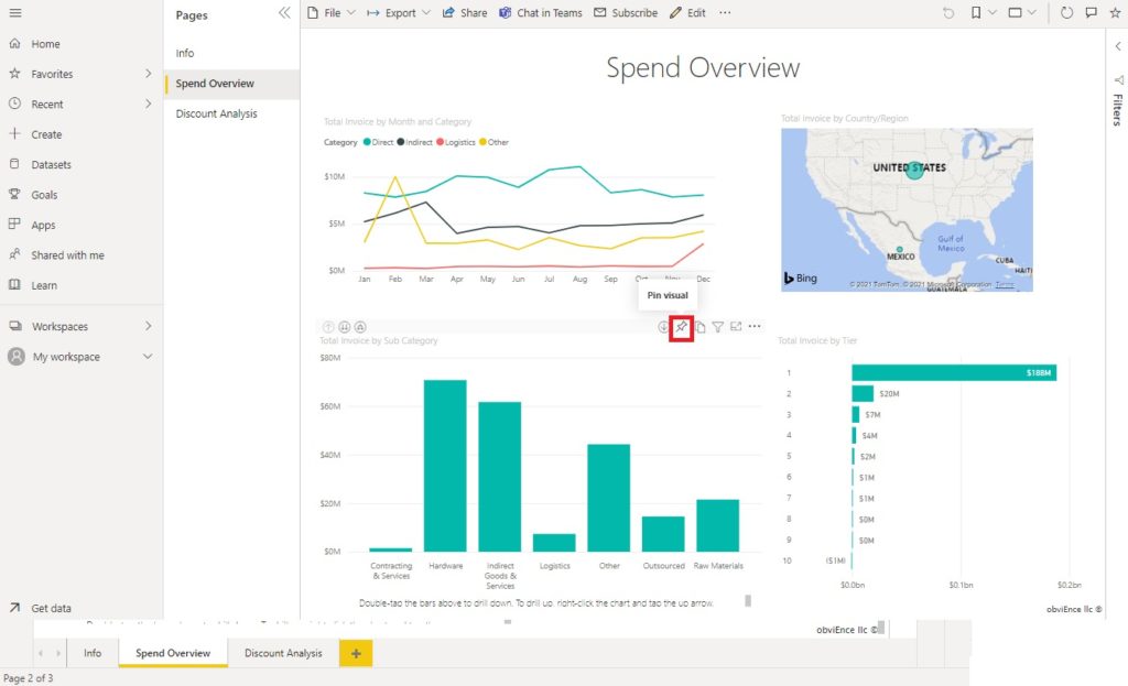
Pin the chart to a new dashboard called Procurement.
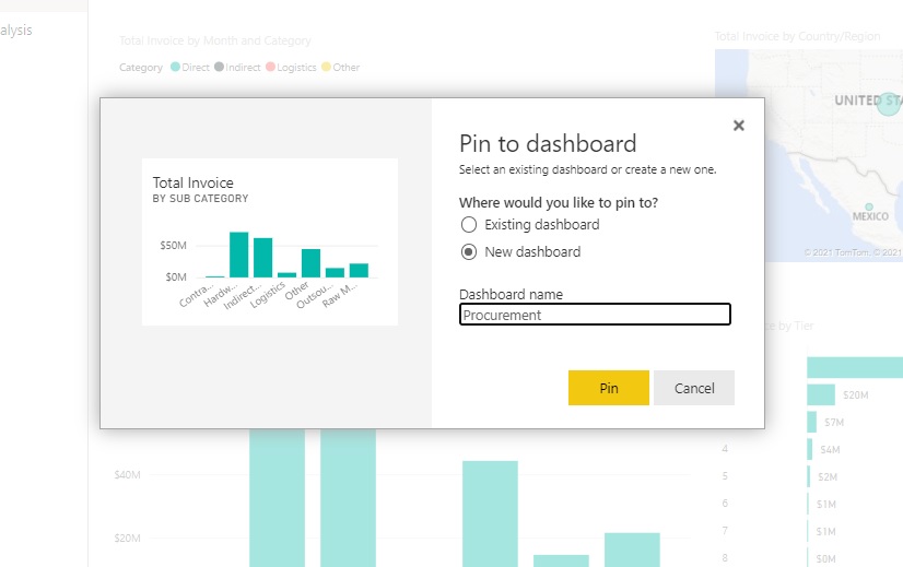
The chart now appears on the dashboard.

Add A Power BI Tile To Display A Chart
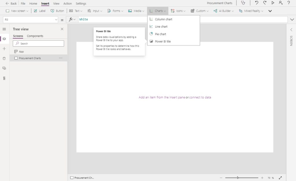
Now we are ready to build the app. Open Power Apps Studio and create a new tablet app from blank. Insert a Power BI Tile onto the screen.
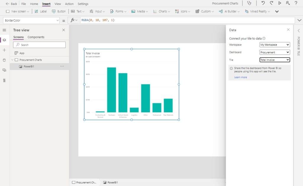
Choose the Workspace, Dashboard and Tile where the Total Invoices By Sub Category chart is found. The Power BI chart now displayed in the app.
Apply A Filter To A Power BI Tile With A Dropdown
Employees at the automobile manufacturer can choose a month from a dropdown and view results for only that month in a chart. Create a new dropdown and place it alongside the chart.
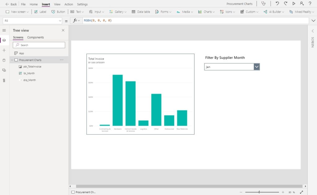
Write this code in the Items property of the dropdown to populate it with the short names of months.
[
     "Jan",
     "Feb",
     "Mar",
     "Apr",
     "May",
     "Jun",
     "Jul",
     "Aug",
     "Sep",
     "Oct",
     "Nov",
     "Dec"
 ]Code language: JSON / JSON with Comments (json)
Now select the Power BI tile and change the AllowNewAPI property to true. The code to filter the Power BI tile will not work unless you do this.
trueCode language: JavaScript (javascript)
Then append this code to the TileURL property of the Power BI tile. It will filter the chart to show only records where the Date/ Mon (table/column) equal the selected dropdown value.
&filter=Date/Mon eq '"&drp_Month.Selected.Value&"'"Code language: JavaScript (javascript)
The full TileURL code should look something like this.
"https://app.powerbi.com/embed?dashboardId=1a98a57b-0639-4346-b3a3-f75537fc8b6c&tileId=87d1d742-8a96-4ddd-9495-b5cb8ffd44c0&config=eyJjbHVzdGVyVXJsIjoiaHR0cHM6Ly9XQUJJLUNBTkFEQS1DRU5UUkFMLXJlZGlyZWN0LmFuYWx5c2lzLndpbmRvd3MubmV0IiwiZW1iZWRGZWF0dXJlcyI6eyJtb2Rlcm5FbWJlZCI6ZmFsc2V9fQ%3d%3d&filter=Date/Mon eq '"&drp_Month.Selected.Value&"'"Code language: JavaScript (javascript)
Test the report filter. When we click the dropdown it should change the Power BI tile to display new results for the selected month.

Display A Full Interactive Power BI Report In Power Apps
Another option is to display the full Power BI report in Power Apps. To do this, go open the Power BI report and get the embed code for a website or portal.
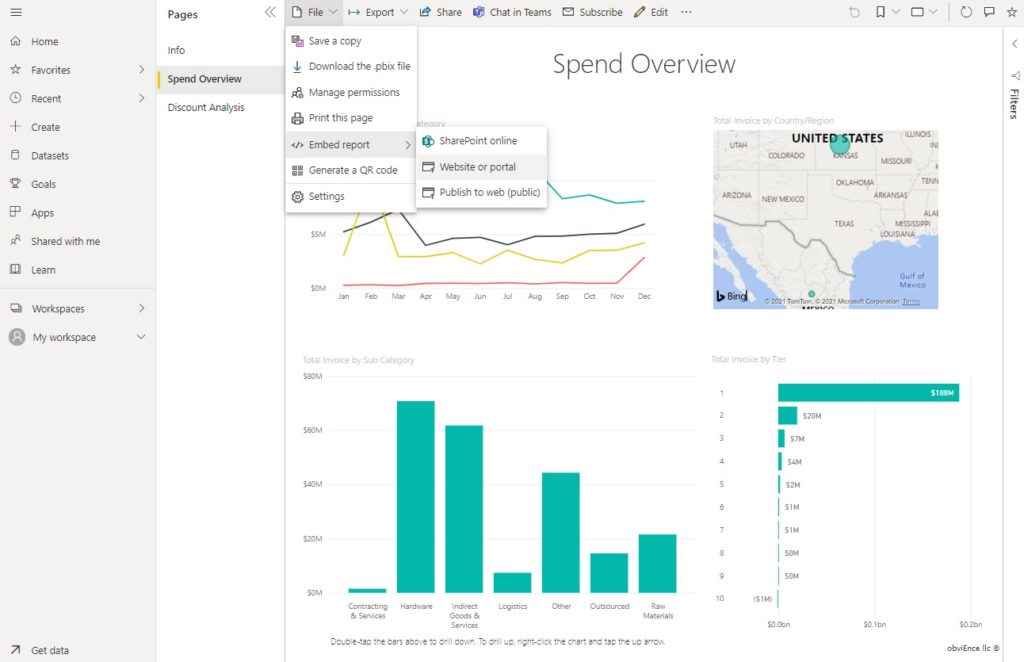
Copy the secure embed code.
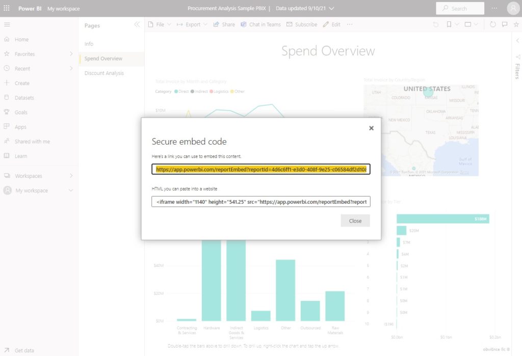
Then create a new Power BI tile in Power Apps and paste it into the TileURL property. Make sure the enclose the embed code between a set of double-quotation marks to make it a text string.
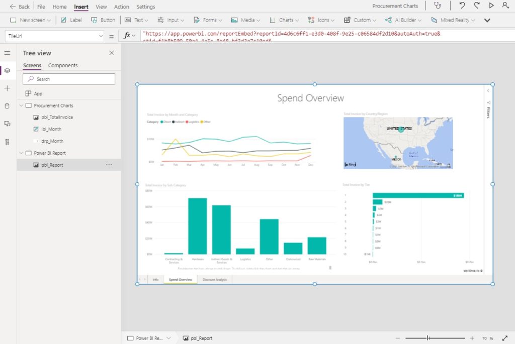
A fully interactive Power BI report is now displayed in Power Apps.
Did You Enjoy This Article? 😺
Subscribe to get new Copilot Studio articles sent to your inbox each week for FREE
Questions?
If you have any questions or feedback about Interactive Charts & Reports With Power BI Tiles In Power Apps please leave a message in the comments section below. You can post using your email address and are not required to create an account to join the discussion.



Nice Post. It’s really interesting. I’m curious to ask more 🙂
How about sharing? If we add a tile in the PowerApp, can any user in the PowerApp see the data? or do you need to share the dashboard with the user and assign a Pro Licence?
Do you know if there is any approach to use the PowerApps without a pro licence? like PBI Embed capacity?
Ignacio,
The viewer of the Power BI tile would require a license to see the report and have it shared with them. For this reason Power BI tiles are the best fit for organizations which already have Power BI or companies who want to get Power BI and use it outside of Power Apps as well.
An alternative to Power BI tiles is QuickChart.io which I shared in my previous article. The licensing cost for it is much more cost effective.
Hi Matthew,
I’ve been trying to export an embedded Power BI report (filtered report view not default report view) to PDF from PowerApps using the Power Bi connection in PowerApps (not power automate). i still cannot successfully do that. I was wondering if you have tried that?
Thanks
Peter,
From my experimentation I have not found a way to filter a Power BI report in Power Apps, only a Power BI dashboard tile 🙁
Can you export a Dashboard tile as pdf without using power automate?
Hi,
Link: https://docs.microsoft.com/en-us/power-bi/collaborate-share/service-embed-secure
I added new dashboard and don’t see it in PowerApps. Also, pinned new tiles yo old dashboard and don’t see them in Powerapps ether. Close and open Power App does not help. What I am doing wrong?
Arkady,
This will sound silly, but sometimes you have to rename the tile after you publish it to the dashboard. It’s a bug with Power Apps + Power BI.
Check out this forums post about it:
https://powerusers.microsoft.com/t5/Building-Power-Apps/PowerBI-tile-dashboard-tiles-not-showing-in-list/td-p/658820
thanks. Another question. How actually filter works? I don’t see any code on drop down Onselect? Another words: how clicking on drop down fire report to pick new value?
Thanks
Hi Matthew,
After I selected dashboard tile from the tile list option, the dashboard tile doesn’t showing up. It’s only shows power bi icon. How to solve it?
I have power bi pro license.
Lisa,
Can you please send a full screenshot of what you’re seeing?
Can you manipulate the size of the embedded dashboard from within Power App to make the embedded dashboard more readable?
Mahalakshmi,
I found the embedded dashboard could be made bigger by stretching the Power BI tile to fill the entire screen. The user can also click on the full screen mode while browsing the dashboard.
Also, you can maximize the available screen space two other ways – change your screen size to ‘fit to screen’ in the settings (responsive) and you can also try removing the navbar like this: https://twitter.com/mattbdevaney/status/1204377905712680961
Nice article, thank you for postin, one small question, can you help how to filter for multiple items from the same field here. In your example, instead of just one monthe what if i need to allow selecting morethan once month power bi tile is filtered accordingly. Appreciate your response with my query.
Anirud,
I seem to remember that only the equals operator would work for me but not greater than, less than, does not equal or contains.
I think if you want to see multiple months you’ll have to group them in the dataset. For example, if you want to group Quarter 1 which is January, February, March you should create a new column in the dataset called quarter, place the value Q1 inside it for Jan-Mar, then filter the BI tile on equals Q1.
I think you can use the “in” operator.
Hi Matthew, another great article thank you! One very annoying feature of embedding a Power BI report in Power Apps is the security warning about the report’s data confidentiality status which now appears by default. This banner slightly obscures the report and does not provide a great UX. I have not yet found a method for switching this off. My current workaround is to use rectangle icons to frame the report to mask the security warning!!
Andrew,
Ugh, that sounds annoying. I wish there was a better workaround for data confidentiality.
Matthew,
Love the walk thru here. It is the BEST, most concise, most accurate “tutorial” I have found so far on this topic.
I tried to create a paginated report as a visual and PowerApps told me ‘Paginated Report Visual is not supported.’
Ok… so then I take a step back.
My PRIMARY goal is meeting this criteria:
User interface is a PowerApp screenSelect an item in a PowerApp combobox and filter the data in a report using the item selected in the Combo-boxGenerate a PDF report that can be downloaded or emailed.Option 1: Power BI Desktop Report
What I Like:The way I can format things in a report with TABLE visualizations and how the generated report looks on the screen and in PDF.What I Can’t Figure Out:I can’t figure out how to get the table visualizations to dynamically expand to show all items – the height of the visualizaton is FIXED.I am not successful in getting the data in the visualizations to get filtered by the item selected in the PowerAppOption 2: Power BI (web), Paginated Report
What I Like:I like the dynamic expansion of the report to print out all the data expectedWhat I Don’t Like:It is challenging to get things formatted how I want them to.Option 3: ?? WhatDo you Recommend
Wish I could brainstorm with you quickly and figure out the most direct way forward to accomplish my PRIMARY goal.
Hey Matthew, this is the most clear article about the topic, thanks for posting.
I have a question, what about the other way around? Can the power bi embedded interact with the power app when the user is selecting some filter or item on a table? Can it retrieve any number or data back?
Thanks!
Anna,
You can do some simple filtering by using Power Apps controls to change a query string in the URL. But more complex-cases are likely off the table.
https://learn.microsoft.com/en-us/power-bi/collaborate-share/service-url-filters
Hi Matthew, thanks a lot for sharing this article is super interesting and so clear.
I was wondering, I have a PowerBi report but it seems to be too heavy so I can barely just see it in the PowerApp but I’m not able to clic and explore it… Do you think that is regardless throughput?
Hey Mathew, how are you? Thanks for sharing! Helped me a lot!
I’m having a little trouble, and wondering if you can help me, about the filter in the chart.
i’ve made the adaptions in my code, but keep showing the message that “The content id not avaliable”, but I ensure there is data to be showing in the chart.
I’ve send you an Image!
Thanks!!!