Table Of Contents:
• Design Empty States
• Refresh Gallery To Show Current Data
• Reset The Gallery Scroll Position
• Filter Large Datasets In A Gallery
• Define The Gallery Sort Order
• Require A Button Press To Update Search Results
• Avoid Nested Galleries
• Use Flexible Height Galleries
Design Empty States
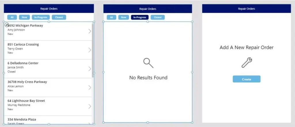
Include an empty state that appears when a gallery has no data. The empty state should tell the user why the gallery is empty and/or give directions on what actions to take next.
Refresh Gallery To Show Current Data
Users expect a gallery to include all recent updates to a datasource. Many times this happens automatically with no extra effort required by the developer. But sometimes a manual refresh of the datasource is needed.
Gallery data will refresh automatically:
- When using a local datasource (i.e. collections)
- During the initial load of a cloud datasource
- After using the app to perform CRUD operations on cloud datasource that the gallery is connected to
Gallery data does not automatically refresh when connected to a cloud datasource (SharePoint List, Dataverse, etc.) but no CRUD operations were performed before entering the screen. In this scenario update, the gallery before the screen is loaded using the Refresh function.
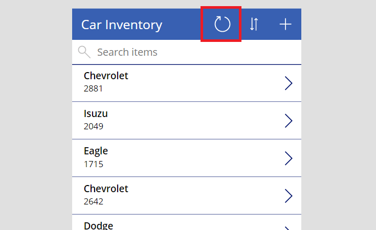
Consider giving users the ability to manually refresh a cloud datasource by pressing a refresh button/icon.
Reset The Gallery Scroll Position
A gallery should show its first item at the top position when a screen is opened. If gallery was previously scrolled and was not reset it will remain in the same position when the screen is opened. To reset the gallery to the top position use this code in the OnHidden property of the gallery’s screen.
// OnHidden property of a screen
Reset(GalleryName);
Filter Large Datasets In A Gallery
Allow users to filter large datasets and get the results they want. Users should be able to filter on multiple fields at once.
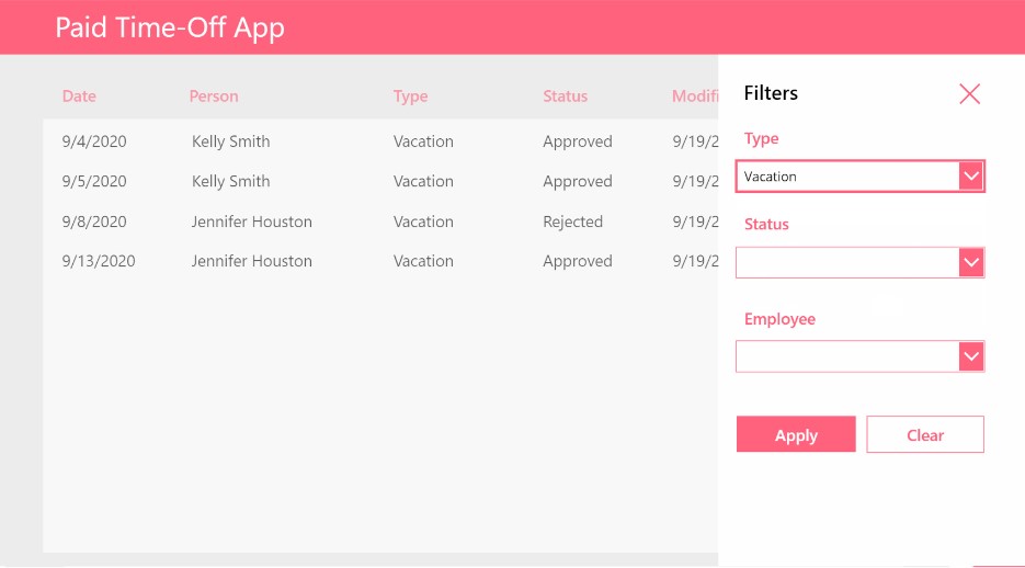
Use this coding pattern in the items property of a gallery to support multiple dropdown filters. The code can also be adapted for other control types (combobox, datepicker, etc).
// ITEMS property of a gallery with three dropdowns filters
Filter(
    'Paid Time Off',
    drp_Type.Selected.Value=Blank() Or TimeOffType=drp_Type.Selected.Value,
    drp_Status.Selected.Value=Blank() Or Status=drp_Status.Selected.Value,
    drp_Employee.Selected.Value=Blank() Or Employee=drp_Employee.Selected.Value
)
Define The Gallery Sort Order
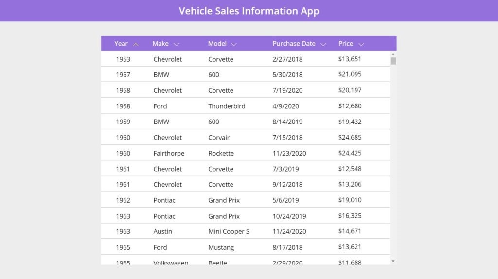
Data displayed in a gallery must be sorted. Galleries should be sorted by the gallery item’s title (ascending) or a date (descending) displayed in the gallery. If not sorting by another column clearly indicate the sort order on the screen.
Giving a user the ability to select the sort column and order is recommended but not required.
Require A Button Press To Update Search Results
Do not update the gallery with new search results as the user types into a text box. This causes poor performance. Each keypress triggers a new query to the cloud datasource and renders the output on the screen. The consequence of multiple queries being executed at once will be slowness in the app.
// Items property of a searchable gallery connected to a text input
Search(Locations, txt_SearchLocation.Text, "Address", "City", "Province")
Instead, require the user to type their search terms into a text input and press a button to search once finished. Set a variable in the button’s OnSelect property and use it as the search string.
// OnSelect property of a search button
Set(gblSearchLocation, txt_SearchLocation.Text)

// Items property of a searchable gallery using a global varible
Search(Locations, gblSearchLocation, "Address", "City", "Province")
Avoid Nested Galleries
Nested galleries are known to cause poor app performance. They are slow to load and consume a lot of memory. In some cases they have been known to cause crashes in apps with large memory usage. Use collections to create a grouped gallery instead of nesting.
Use Flexible Height Galleries
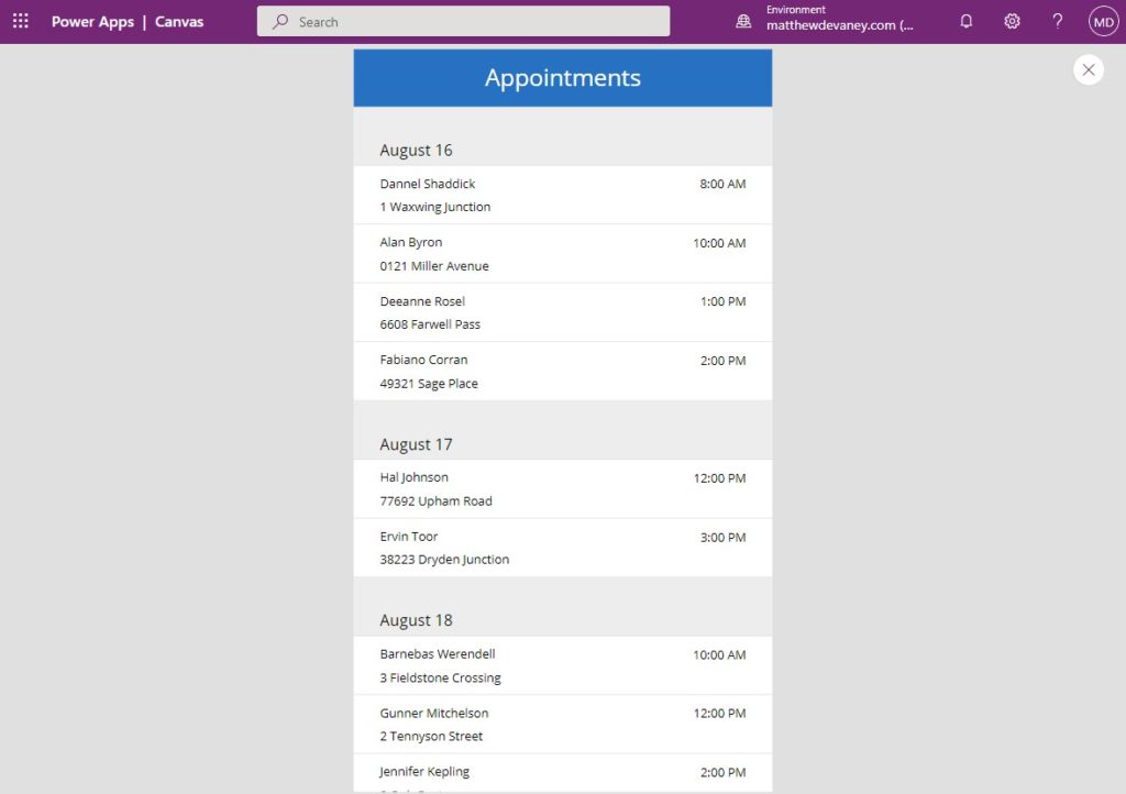
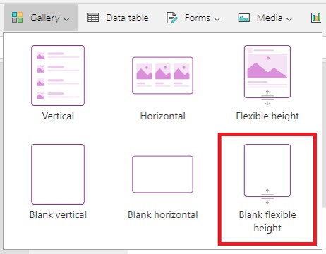
Always use a flexible height gallery instead of a blank vertical gallery. Flexible galleries have all of the same properties as a normal gallery plus they will expand to fit a row’s contents. If an app’s design changes to require flexibility during the development process it will be necessary to start over and completely redo the gallery.
Did You Enjoy This Article? 😺
Subscribe to get new Power Apps articles sent to your inbox each week for FREE
Questions?
If you have any questions about Power Apps Gallery Design & UX Guidelines please leave a message in the comments section below. You can post using your email address and are not required to create an account to join the discussion.

Hey Matthew, when you say avoid nested galleries because of performance I have a question. I have a gallery in which has project data, but the contact information for that project is in another table. Nested galleries will show that. Recently I went back to using a lookup field in the gallery instead of a nested one. Which one one would you say is best? I thought I had read that loading time would be slower when using lookups.
By the way, thanks for all of your work!!
Matthew, how can I make a responsive gallery like the one of the cats at the top of this page that fill the width of the screen then wrap to the next row?? Useful for image galleries.
Raymond,
The fastest way is to load the WrapCount property of the gallery with App.ActiveScreen.Size. Then you place an Image inside the gallery with an ImagePosition of “Fit”, Height set to Parent.TemplateHeight and Width set to Parent.TemplateWidth.
Great to have this kind of reference!
For the “Design Empty State” -section it would be good to add also link to more details. Like for example here: Show Message If A Power Apps Gallery Is Empty – Matthew Devaney
man, u are just the best! really, super useful! never stop!
GC Tech Lab,
That’s right! I never stop never stopping!
Thanks muchly for all that you do. You’re one of a few PowerApps gurus that have been instrumental in everything I’ve managed to build with these platform.
Now, the request:
Can you see if you can reproduce the unexpected behaviour that is occurring with both the Classic and Modern FlexHeight galleries? Both are rendering overlapping rows even if there is nothing flexible inside the gallery.
Here are the specifics:
Insert a flexible height gallery. Connect it to the data source of your choice.
Insert just four controls:
A 2px rectangle at X=0, Width = Parent.Width
A label with the data of your choice from the datasource. Y=2. Width = Parent.Width. Height = 17 (you could likely change the height without effect.
A label with data of your choice from the datasource. Y=Label1.Y + Label1.Height. Width = Parent.Width. Height = 29(you could likely change the height without effect.
A button with data of your choice from the datasource. Y=Label2.Y + Label2.Height. Width = Parent.Width. Height = 30.
I won’t explain what I get when I execute this test. We can just compare results after you attempt it if you do.
Version: 3.24111.12
I also pulled the version forward to the unpublished beta and pushed it back two and four version levels and nothing changed.
Lots happens in 3 days. It turns out that PowerApps does something weird when you turn on auto-scaling in the app settings. If you change a gallery from regular to flexible height, it will never render the change properly. I finally realized something was wrong when I created a brand new empty app and the gallery worked fine. That meant the problem was in the app specifically.
Toggling Scale to Fit off and on resets something in the way the editor generates the underlying html it seems.
So the takeaway is:
If you’re having weird gallery rendering behaviour, try switching the Scale to Fit toggle, publish, change back and publish again.