Purpose
A radio group control allows users to select one option from a set of mutually exclusive options. Its purpose is to provide users with a list of options to choose from, ensuring that only one option can be selected at a time.
Properties
| AccessibleLabel Screen readers will voice this text when a user selects the control |
| ContentLanguage Describes the language used to the audience (e.g. “en-US”) |
| DefaultSelectedItems Initial values displayed in the control before the user interacts with it |
| DisplayMode Selects the mode: Edit, View or Disabled. In Edit mode the user can input values. In View mode the user can only see the values and in Disabled mode the control is greyed-out. Options: = DisplayMode.Disabled = DisplayMode.Edit = DisplayMode.View |
| Height Distance from the top of the control to the bottom |
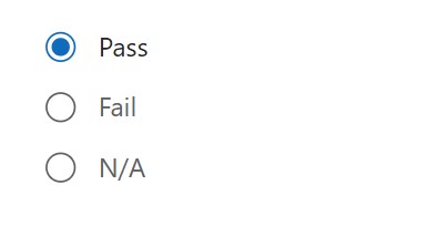
| Items Table containing values displayed inside the radio group Example: [“Pass”, “Fail”, “N/A”] |
| Label Text to display beside the checkbox |
| OnChange Actions that will be executed when the Value property of the checkbox changes |
| OnSelect Actions that will be executed when the radio group is pressed. |
| Required Unknown purpose. |
| Selected Radio group record selected by the user |
| SelectedItems Dropdown list item records selected by the user |
| Visible Determines whether to show or hide the control |
| Width Distance from the left side of the control to the right side |
| X Distance from the left edge of the screen to the left side of the control |
| Y Distance from the top edge of the screen to the top of the control |
How To Setup The Power Apps Radio Group Control
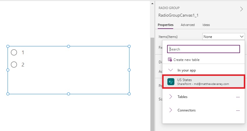
1. Select the radio group control in Power Apps studio. Choose the datasource from the Items menu.

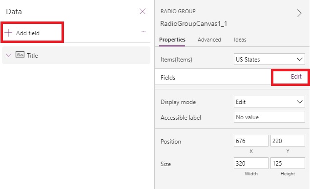
2. Edit the fields. Add at least one field to the dropdown. The first field will show in the dropdown items list.

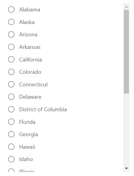
3. Click on the dropdown control to see the list of items.

4. Get the selected item’s Title field by using this code.
RadioGroupCanvas1.Selected.TitleDid You Enjoy This Article? 😺
Subscribe to get new Power Apps articles sent to your inbox each week for FREE
Questions?
If you have any questions or feedback about Power Apps Radio Group – Modern Controls please leave a message in the comments section below. You can post using your email address and are not required to create an account to join the discussion.
Can you order the items Horizontal?
Bryan,
Yes, try changing the Layout property from Vertical to Horizontal
For the modern control, I do not see the layout property as an option. How can I do this for a modern radio button?
Peggy,
You cannot do it yet. But the final product will have it.
Trying to use it, but the items are coming in very small. Is there a way to make the text larger?
How do I make this a mandatory field, where the user cannot move forward through the app unless an option is selected?
How do you set a default selected option on this control?
I have same question , anyone knows ?
I also and wondering how to set the default selected option. Mine has two items: “self” and “finance”. I would like “self” to be default, but it is not working
This worked for me:
In DefaultSelectedItems put {Value: ThisItem.ChoiceFieldName}
If you are trying to set the default value to what is already in Dataverse, but your gallery (that contains the radiogroup control) is based on a filtered collection of records from Dataverse (rather than based on the Dataverse table directly), things get a little bit more complicated, but it’s based on Arevik’s answer:
[{Value: LookUp(‘Name of Dataverse table‘,’Column name you can match on‘ = ThisItem.’Same column name‘,ChoiceFieldName)}]
Essentially, this is the same thing, but since you are using a collection, you have to do a lookup to Dataverse to get the value of the choice column for the same record.
I have used following code in the “defaultselecteditems”:
Table({Value: If(IsBlank(ThisItem.'mychoicecolumn'), 'mychoicecolumn'.'mydefaultoption', ThisItem.'mychoicecolumn') })Am I right in saying we can’t change the order of items in the new Radio Group – they are always sorted alphabetically on the first field? For example, show the radio options from a SharePoint list that displays “Title” column but sorts on another numeric “SortOrder” column. Seems like a bug.
Hi, How can we set the height automatically based on the number of choices? I know of a way where we count the number of choices and then multiply by an approximate line-height… e.g. CountRows(Split(ThisItem.Choices,”;”)) * 35
The issue arises when my choice text has multiple lines…
I am using the modern radio group with a button to patch data to a SPO list. The radio controls are within the gallery, while the button is on the screen. Right now when I patch the data collected, it resets the previous selection and sometimes clears out patched data in the SPO list. I know I need to use the DefaultSelectedItems property, but am unsure of the code. Is this do-able?
I have a gallery control and I have a requirement to show a radio button which will show one of the field in the collection which is binded to the gallery
Is it possible to have the options displaying for a radio button dynamically changing? For example, based on a condition, all options will display, or only option 1 and 2 (out of 3) will display?
Is there a way to adjust spacing between the lines of an item? This is not the same as ‘Line height’. Line height produces the same space between each line, even wrapped lines. Akin to paragraph spacing, if one of the items is longer it may wrap and begin to look like two items, when it’s really one that has wrapped…see picture. I would like that spacing to be controllable.
Thank for this! but for me RadioGroupCanvas1.Selected.Title is not working. I cannot get the selected value no matter how I try…