Power Apps Tabbed Form With An Awesome-Looking Design

When a Power Apps form is very long a tabbed form can make it more organized and easier to use. A tabbed form is simple to build – create one button for each tab at the top of the form, when the user clicks on a tab store it’s name in a variable and then show only fields that should appear on that tab. Your users will love having all similar fields grouped together one one screen without having to scroll.
In this article I will show you how to make a good-looking design for a Power Apps form with tabs connected to a SharePoint list.
Introduction: The Sales Contacts App
The Sales Contacts App is used by salespeople at a paper supply firm to view information about the people they sell products to. The salesperson can move to another section by clicking the tabs at the top of the form.
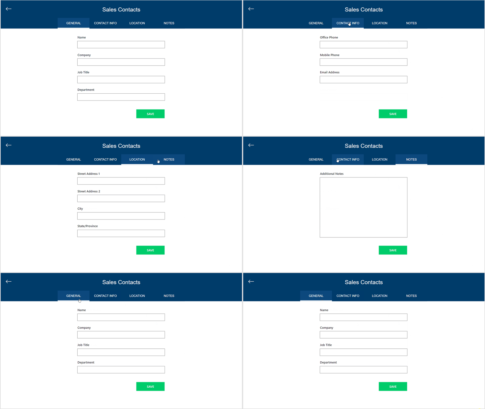
Setup The SharePoint List
Create a new SharePoint list called Contacts with the following columns. All columns are type single-line text with the exception of AdditionalNotes which is type multiple-line text.
- Name
- Company
- JobTitle
- Department
- OfficePhone
- MobilePhone
- EmailAddress
- StreetAddress1
- StreetAddress2
- City
- StateProvince
- AdditionalNotes
Insert Buttons To Use As Power Apps Form Tabs
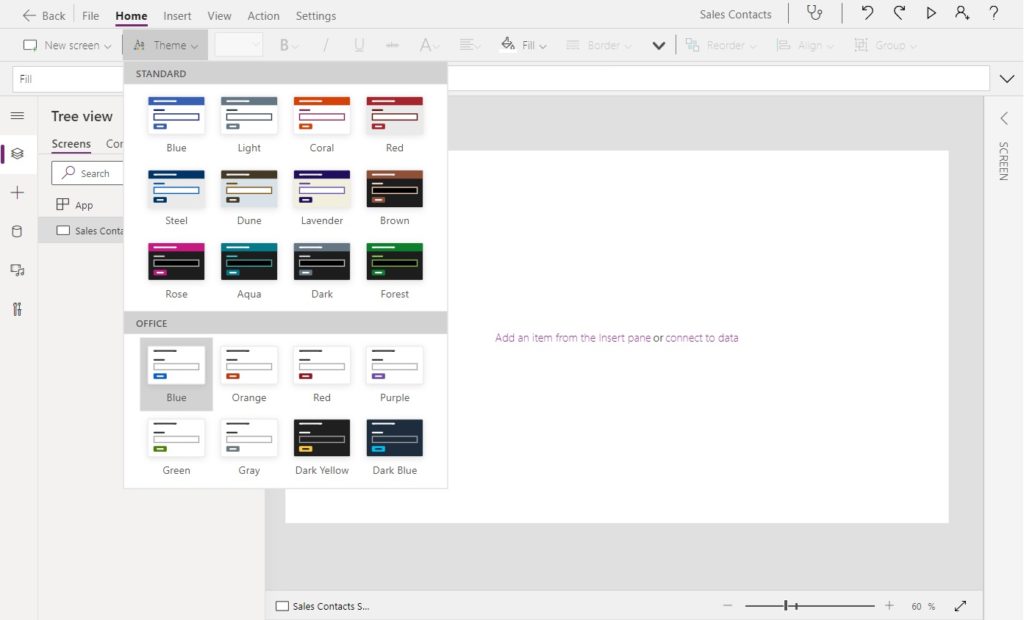
Open Power Apps Studio and create a new tablet app from blank. Set the app theme to Office Blue.
Insert a new label with the text “Sales Contacts” at the top of the screen to serve as a title bar.
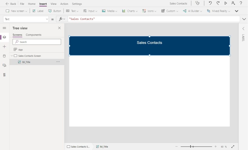
Use this code in the following property of the label.
Fill: RGBA(0, 60, 106, 1)
Font: "Helvetica"
Height: 160
PaddingLeft: 5
PaddingRight: 5
PaddingTop 5
PaddingBottom: 60
Width: App.Width
X: 0
Y: 0Code language: JavaScript (javascript)
Then create 4 new buttons which will become the form tabs. Position them side-by-side at the bottom-center of the titlebar label. Each button’s text should reflect the name our form tabs: GENERAL, CONTACT INFO, LOCATION and NOTES.
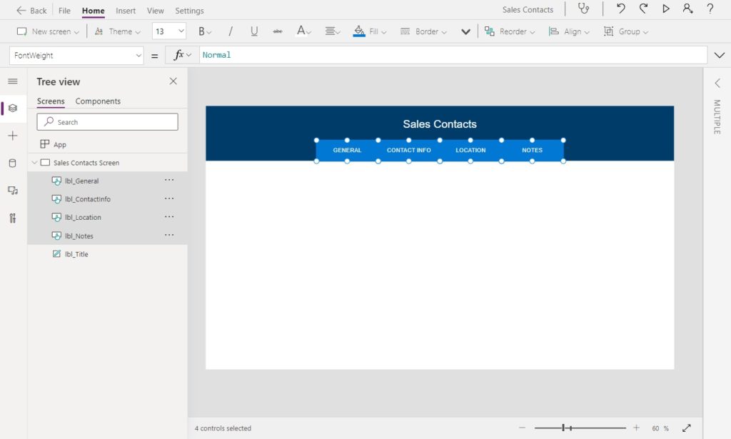
To match the size and font in the image above use this code in the following properties of the tab buttons.
Font: "Helvetica"
Height: 60
Width: 180Code language: HTTP (http)
Change The Button Fill For Current Form Tab Selection
When a tab becomes selected it should change color to show which section of the form the user is viewing. For the current tab we will make the button fill a brighter blue than the titlebar. Then we will leave the other tabs transparent so they blend into the titlebar.
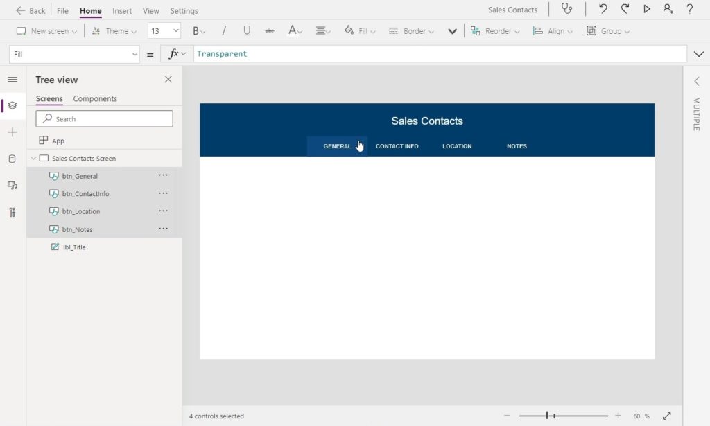
Use this code in the properties of all 4 button tabs to achieve the desired styling.
Fill: Transparent
HoverFill: RGBA(17, 77, 133, 0.70)
PressedFill: RGBA(17, 77, 133, 0.70)Code language: HTTP (http)
Track The Current Tab Name In A Variable
Next we will write the logic to track which form tab the user is currently viewing.

Write this code in the OnSelect property of each button to set the current tab to match the button’s text.
Set(varCurrentTab, Self.Text)Code language: JavaScript (javascript)
We should also make sure to set the current tab to GENERAL when the screen becomes Visible. Otherwise, no tab will initially be selected and nothing will show in our form once we build it.
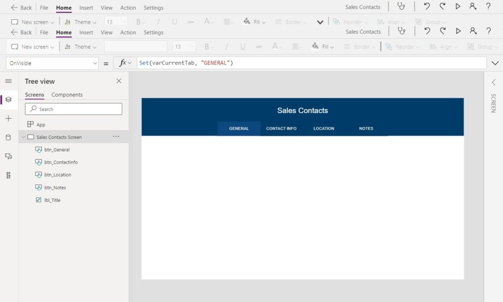
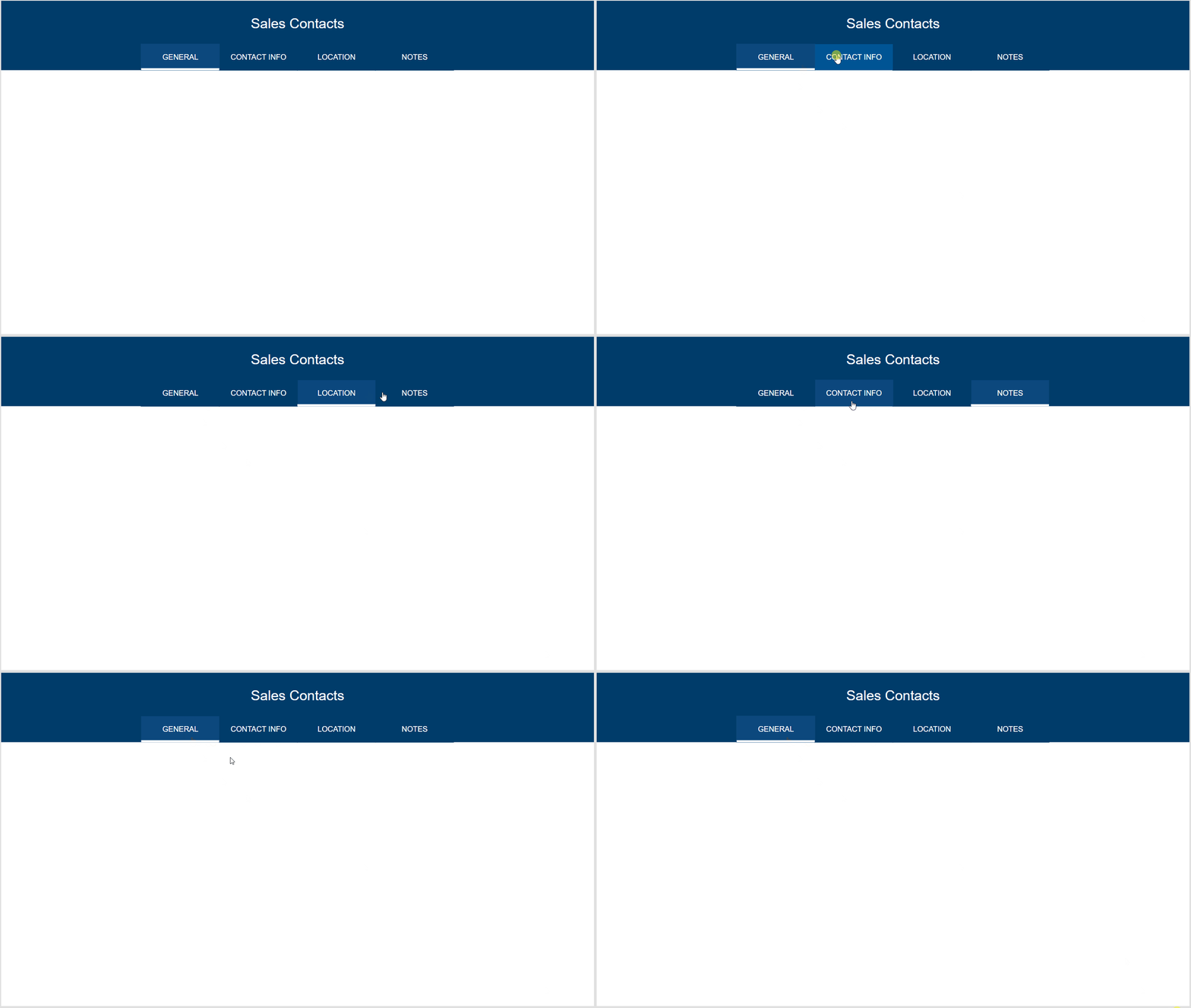
Our tabbed form now has tabs that are highlighted for the current section and a hover effect when the user moves the cursor over them.
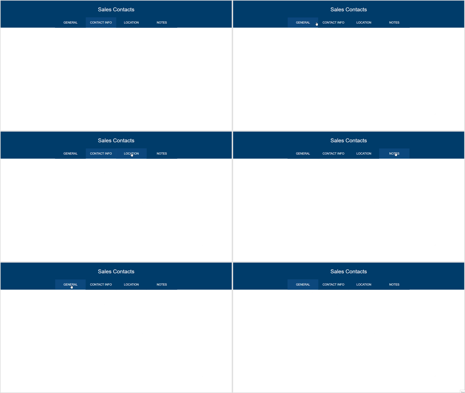
Underline The Current Power Apps Form Tab To Improve Usability
The form tabs have the same color whether the user has selected a tab or is hovering over a tab. To improve usability we will also indicate the current tab another way – a white underline. Insert a new label directly below the the GENERAL tab.
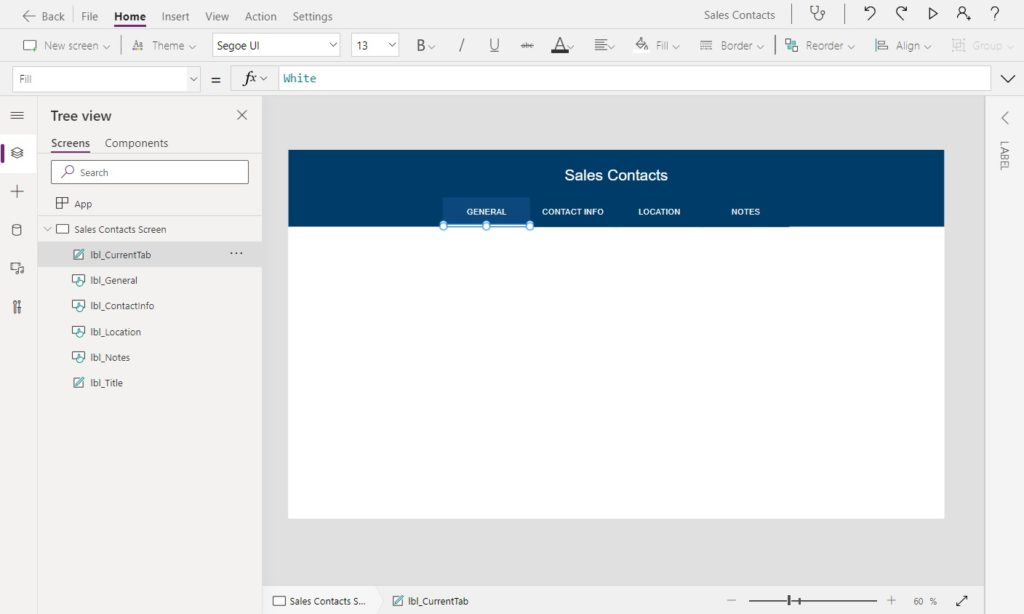
Make the label as wide as each button and 5 pixels tall.
Height: 5
Width: 180Code language: HTTP (http)
Now we will write some code to update the label’s position based on which tab is selected.

Write this code in the X property of the white label.
Switch(
    varCurrentTab,
    "GENERAL",
    btn_General.X,
    "CONTACT INFO",
    btn_ContactInfo.X,
    "LOCATION",
    btn_Location.X,
    "NOTES",
    btn_Notes.X
)Code language: PHP (php)
When a form tab is selected the white label moves to a new position directly below the button text.
Insert A Single Column Edit Form
We are finished building the tabs system for our form so the next task is to add the form itself. Start by adding a connection to the Contacts SharePoint list to the app.
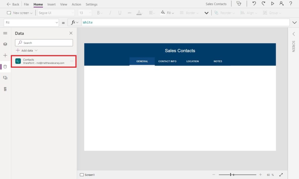
Then insert a new Edit Form and use the Contacts SharePoint list as a datasource. Delete the Title and Attachments fields. We do not require them for this app.
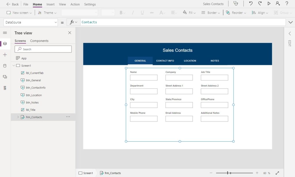
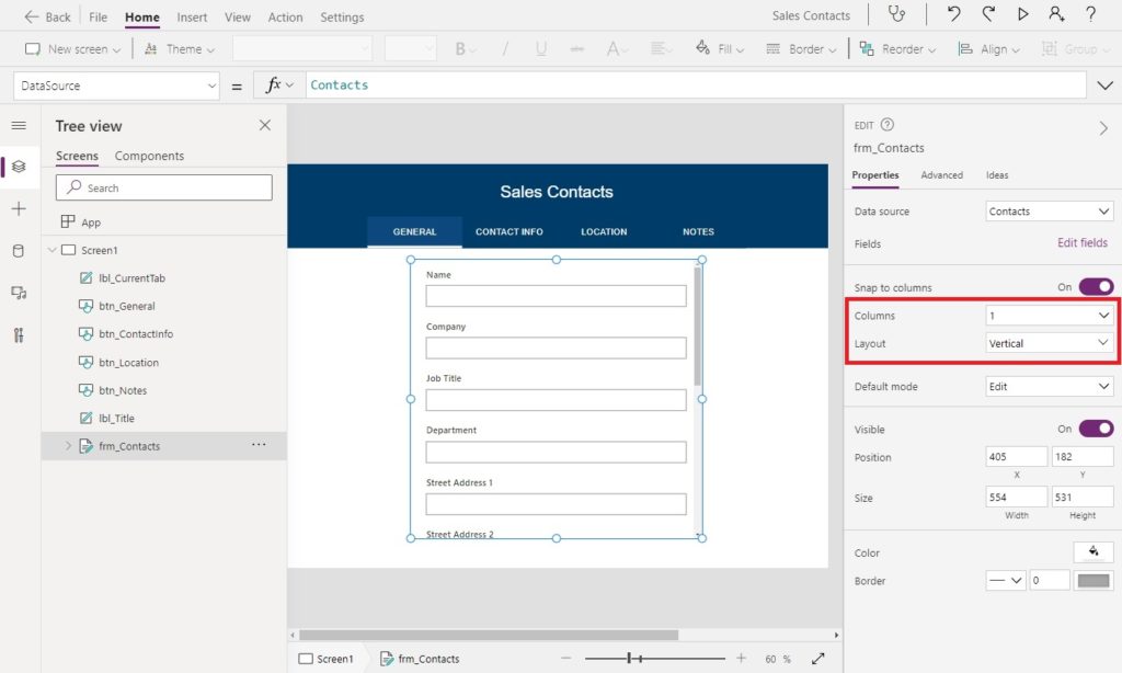
Change the form to a 1 column form with the layout vertical using the right-pane. The form fields will now be stacked in a single column.
Show Form Fields Only For The Current Tab
When a user selects a form tab only fields in the current section should appear and the remaining tabs should be hidden. We can make this happen with some simple logic.
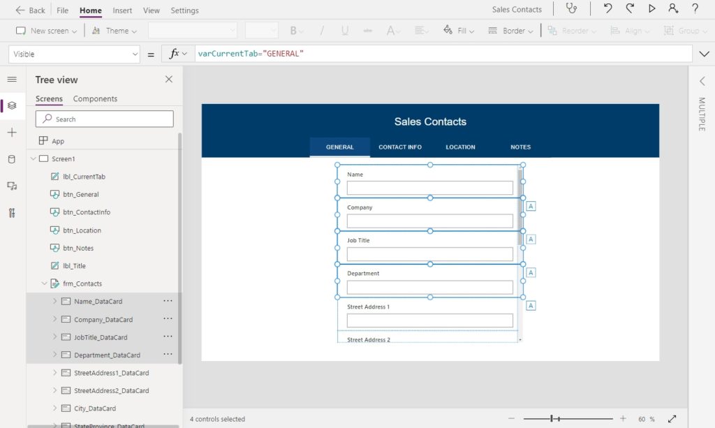
Select the following 4 DataCards: Name, Company, JobTitle and Department. Then use the following code in the Visible property of the cards. Now they will only show when the current tab is GENERAL.
varCurrentTab="GENERAL"Code language: JavaScript (javascript)
Do the same for OfficePhone, MobilePhone and EmailAddress:
varCurrentTab="CONTACT INFO"Code language: JavaScript (javascript)
StreetAddress1, StreetAddress2, City and StateProvince:
varCurrentTab="LOCATION"Code language: JavaScript (javascript)
And finally for AdditionalNotes:
varCurrentTab="NOTES"Code language: JavaScript (javascript)
One more thing: the additional notes field only has a enough space for a single line of text. However, we defined it as a multiple-line text field in SharePoint. Increase the height to 340 pixels and change the mode to multiline to fix this problem.
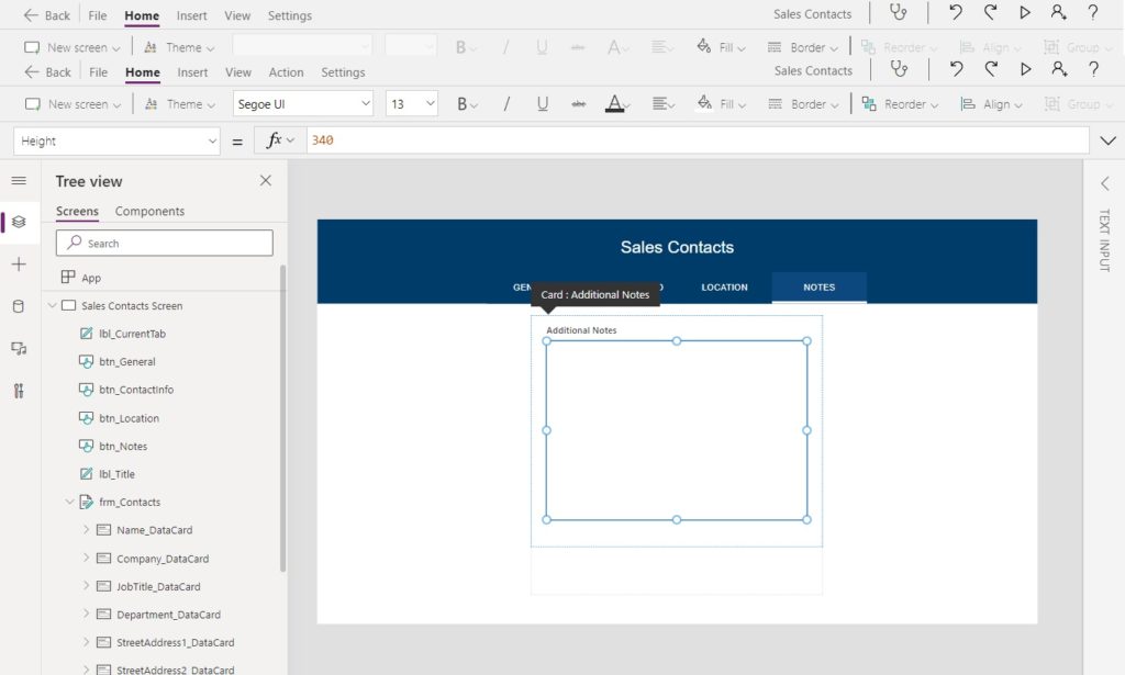
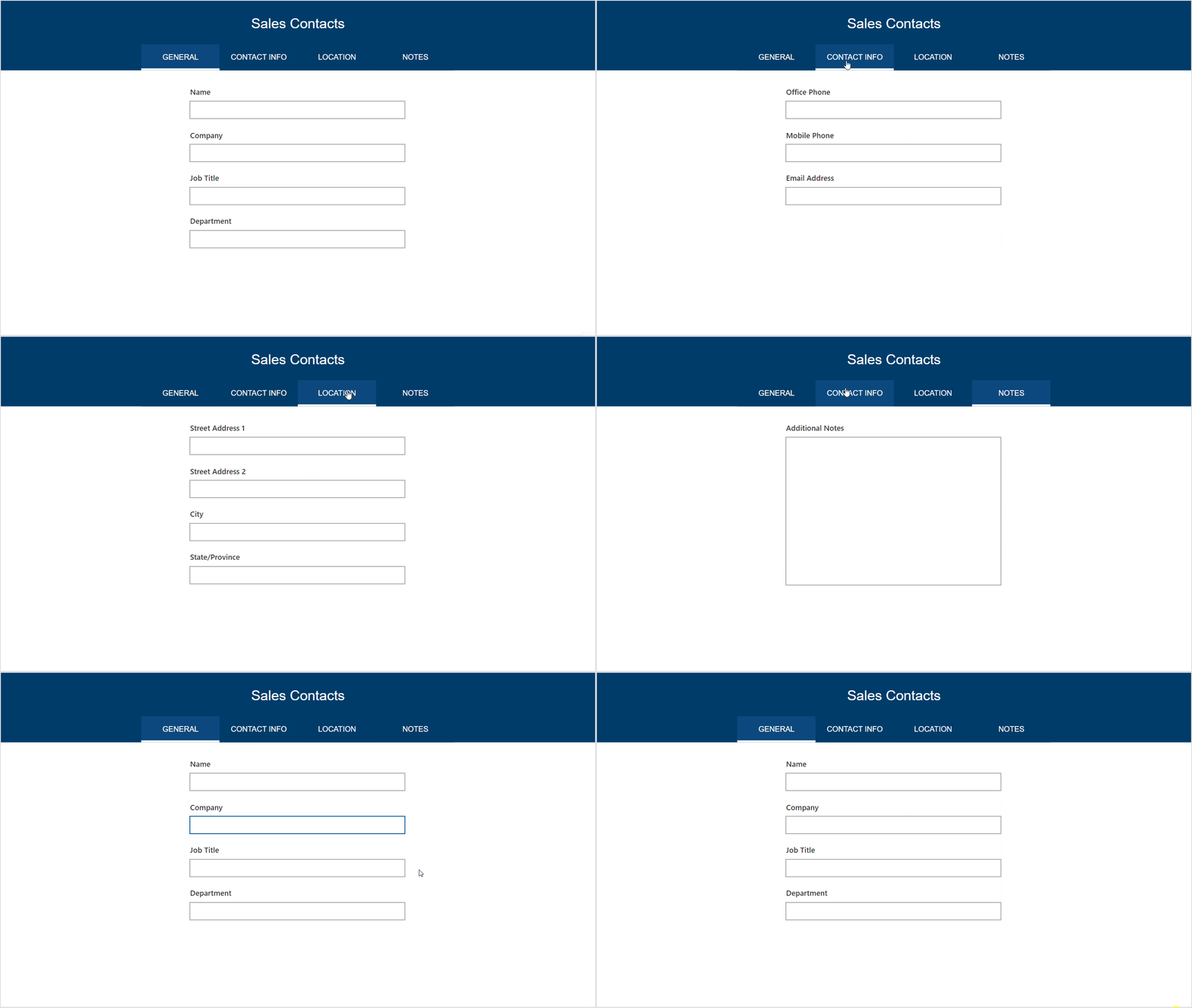
Now the Power Apps tabbed form we built only shows the fields for the current selection when clicked. Make sure the FormMode is set to FormMode.New otherwise, you will get an error that says form isn’t connected to any data yet.
Saving Data In A Power Apps Tabbed Form
Saving the data in a Power Apps tabbed form is easy. It can be done exactly the same way as a normal non-tabbed form. Insert a green button onto the screen directly below the form.
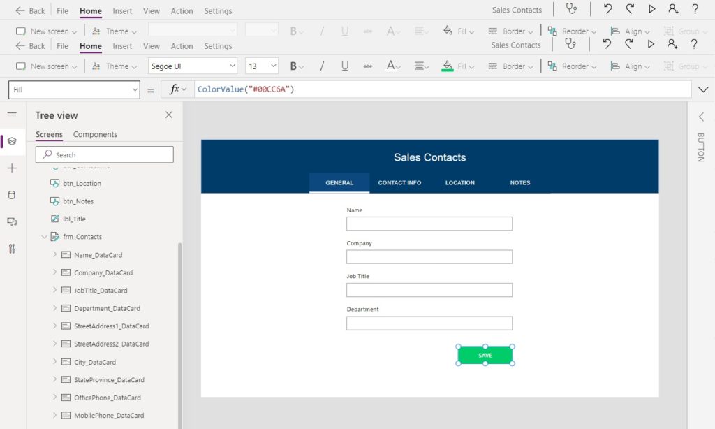
Change the DefaultMode property of the form to this code to create a new record when the form is submitted.
FormMode.NewCode language: CSS (css)
Then write this code in the OnSelect property of the button submit form data to the SharePoint list.
SubmitForm(frm_Contacts)Did You Enjoy This Article? 😺
Subscribe to get new Copilot Studio articles sent to your inbox each week for FREE
Questions?
If you have any questions about Power Apps Tabbed Forms With An Awesome-Looking Design please leave a message in the comments section below. You can post using your email address and are not required to create an account to join the discussion.



Hi Matt,
I thought that I would let you know that I done this to one of my apps but instead of sending to one SharePoint list, I can send data to 4 different lists.
Last year I found that people in some cases had to fill out several forms after an incident and it was costing time to go to several lists.
So for others reading this article, this is a good starting point for more advanced form designs and multi reporting in one place
Daniel,
I love your idea of using a tabbed form to consolidate several SharePoint lists. Agreed, this is simply a starting point. I like to give people the basics and let them take it further if needed.
Hi Matt, I recently discovered your blog and it’s fantastic! This is a really nice looking design for a tabbed form, and efficient way of coding it. I just noticed one thing – in the section subtitled “Track The Current Tab Name In A Variable” you may have meant to write “Set” not “Self” in “Self(varCurrentTab, Self.Text)”
Cheryl,
I am glad you are enjoying my blog. Thanks for sharing the typo you found. I’ve applied a fix and you should see it published very soon 🙂
Hi Matt,
I do not know why, just trying to figure it out. The Pressfill RGBA(17, 77, 133, 0.70) is not working for me. It would seem the transparent is playing tricks on the button. Button hoverfill works but once the button is present color of the back label is seen and not the lighter shade of blue.
Same here, I have tried multiple things and cannot get it to stay the correct color. I am following hoping Matt has a response.
Patrick,
I fixed this issue just now with the following in the Fill property:
I was having the same issue and your fix has worked Matthew, thanks for that!
You’re welcome Scott!
Hi, Matthew, excellent article as always! Easy to follow, succinct, and it works!
Feedback here is that the article above does not have this new code in it. 🙂
Thanks for your contribution of experience and knowledge!
Sam,
That’s a good call out. I have now added instructions on how to change the form mode to New so it creates a new record in the SP list.
I didn’t think about the Switch function but did this instead:
Fill = If(varCurrentTab=”Laptop Details”, RGBA(39, 67, 125, 0.50), RGBA(0, 0, 0, 0))
Yes, you can do color.Transparent instead.
Hi Patrick,
I came across exact same issue, and I tried this code piece:
If(varSelectedTab=Self.Text,
App.Theme.Colors.Darker50,
App.Theme.Colors.Primary)
here varSelectedTab is the varCurrentTab (I changed the name as per my preference).
This code is working fine. Use it for the fill property on each button.
PS: Thank you for the informative blog @matthew Devaney. Good thing that I have subscribed for an email notification to keep my self updated. This came in handy for my task.
Hi Matt,
I have applied this to a vertical tabbed gallery however I am finding that the menu items are repeating themselves. See my screenshot.
Is there a way to stop this happening? I still need to add in another couple of items but currently the repeating issue is causing problems with space.
Chris,
What code did you use in the Items property of the gallery? I will need this code to understand what’s going on.
Hi Matt,
This is the code used:
[{Tab: "Harm to children"},{Tab: "Misuse of Drugs/Alcohol"},{Tab: "Non-use of prescribed medication"},{Tab: "Other offences"},{Tab: "Physical Health/Disability"},{Tab: "Risk from others (partner, family, friends)"},{Tab: "Risk to others due to Drug/Alcohol use"},{Tab: "Risk to others from living conditions"},{Tab: "Risk to others from partner"},{Tab: "Risk to others from pets"},{Tab: "Risks relating to mental health issues"},{Tab: "Self neglect"},{Tab: "Sexual exploitation or Sexual Offences"},{Tab: "Suicide/Suicidal thoughts or threats of"},{Tab: "Victim of harassment"},{Tab: "Violence to property"},{Tab: "Other"}]Hi Matt:
I have used a horizontal gallery of Buttons quite successfully to provide a tabbed PowerApp screen.
The Gallery is set up with a table of values like this
[ { ID: 1, ButtonText: “General”, Tag=”GENERAL”}, … ].
The Gallery Buttons’ Text Properties are set from ThisItem.ButtonText. The color scheme for the Active buttons is generally a dark background and a light text; the Inactive (selected) button has a pale background and a dark text.
My approach may be useful in reducing the amount of button-management code in the OnSelect of the button(s). Adapting your example, varCurrentTab would be set in the onSelect action formula as below:-
UpdateContext({ varCurrentTab: ThisItem.Tag} )
After all Microsoft did bill this as a “low code” solution, didn’t they?
Jimbo,
Yes, I agree using a horizontal gallery is also a valid solution if all your tabs are going to be the same width. It has the benefit of reducing the number of controls on the screen and centralizing the button code in a single control.
Lol, yes Microsoft says this is low-code. I’d say Power Apps is low-code when compared to building your own website from scratch. Its all relative. I just love how you can actually see the app as you’re building it in Power Apps.
Hello Matt,
I currently have a form very similar to this. I wanted to ask, is there a way to have a ‘Next’ button to navigate users through the form instead of the tabs?
Per your example, inserting a next button to guide the user from ‘General’ to ‘Contact Info’
Please let me know, thanks!
Chinda,
Use this tutorial instead:
https://www.matthewdevaney.com/absolute-best-way-to-make-multiple-page-forms-in-power-apps/
Hey there – this is amazing, thanks for putting it together. One question though, once I’ve set the fields to be Visible in specific tabs, am I kind of stuck when it comes to editing the form? It seems like I have to go back and set them all back to True, design the form (names, tooltips, etc) the way I want it, THEN set the fields to be visible for the specific tabs – am I missing something obvious?
Matt,
Thanks for sharing this. Love the look and functionality. Unfortunately, Text is not available for me to select when using Self. I am using PowerApps through MS Teams, so I’m not sure if that has anything to do with it or not. If Self.Text is not available, the whole thing results in a huge set of errors for me. Any ideas?
Brian,
Not sure why its missing. I feel like it should be there. As you have already noted, my tutorial is not taking place in Teams.
Hi Matt,
Very usefull, thanks for it.
I have a question. How can I sen this views depend on Roles?
F.e: I am admin I can see All tabs, Another user with User role can see only location tab?
Yerlan,
Check out this tutorial called “Designing A Role Based User Interface”
https://www.matthewdevaney.com/designing-a-role-based-user-interface-in-power-apps/
Hello Mat!
I came across your site trying to find a solution to my tabbed form, i was hoping to find maybe the info here in this tutorial, sadly i didn’t but do you know if there is a way, when you select a tab and go to another screen, how to make one of the tabs the default? because when i come back to the form screen it shows me the last tab i selected instead of the first page again.. How could i fix that?
Hi Matt,
Great feature; I used it couple of times already.
The one I’m working on has multiple forms from couple of libraries and it is really neat how you can navigate quickly between them by clicking on the tabs. One issue that I cannot solve on my own is to have the Screen opening with a specific tab (e.g.: “Draft”). I tried in multiple ways setting the “varCurrentTab=”Draft” for the App to OnStart and StartScreen without success. I am getting a crippled version of the App (once I start clicking on Tabs, it shows OK but the initial view is not a pretty picture).
Thank you in advance for your suggestions
Jack,
Try using this code in the OnVisible property of the screen.
Set(varCurrentTab, “Draft”)
StartScreen is not meant for this purpose. It accepts a screen name that will be the first opened when the app is opened.
Thank you for the hint; the “penny felt” after seeing it.
I used nested “IF’s” to change the background color based on tab selection and the system used the last one when nothing was selected (such when you start the App).
I added one more “IF” and the “no selection” is showing great. The new “Screen1/Fill” is now: If(varCurrentTab=”Approved”,RGBA(232, 244, 217, 1),If(varCurrentTab=”Draft”,RGBA(252, 252, 217, 1),If(varCurrentTab=”Obsolete”,RGBA(250, 220, 220, 1),If(varCurrentTab=”QA Review”,RGBA(255, 232, 163, 1),If(varCurrentTab=”Owner Review”,RGBA(255, 232, 163, 1),RGBA(255,255,255,1)))))) the bold part was set wrong previously.
Thanks again for sharing your knowledge and support.
Jack,
I’m glad you were able to get to the answer 🙂
HI Matt,
I constructed my page with 4 tabs. But I got an accessibility feedback – users were expecting that these tabs should be navigable with left/right arrow keys instead of tab key from the keyboard. is there any way to address this feedback?
Thank you!
Sudheer,
You could implement the Power Apps Creator Kit keyboard shortcuts code component to address the feedback.
(Link: https://learn.microsoft.com/en-us/power-platform/guidance/creator-kit/keyboardshortcuts)
Hi Matt,
I very much enjoyed your videos and the content on various topics. Thank you. Here is my question regarding the Tabbed design. The data source/capture is a SharePoint List and I have created an employee profile Tabbed Form based on your instructions
where employees can upload their pictures, fill out the form, and insert their information. Information includes but is not limited to Names, Phone #, email addresses, etc.
It also includes 4 main Ta bs namely: Bio, Info, Skills, and Projects. However, The employee skill sets (a multi-choice field)
have nested Tabs… meaning, the main skill Tabs include Software, Research, Fields, and Project management. These four branches of skills each have nested sub-skills.
For example, Software includes at least 10 multi-select choices. Same patterns for Research, Fields, and Project Management.
I have a problem assigning different skills to nested skills tabs. For example, I want to assign all employee’s software skills to Software Tab
and all his/her skills in research to the Research tab. How do I assign a software skill that is both under Skills (main tab) and under Software Skills (nested tab)?.
I resorted to CHatGpt and the clue I received, haven’t tried it yet, is to create Galleries for each nested Tabs. Any thoughts and guidnace are greatly appreciated.
Thank you,
Helal
Helal,
To show a control for more than one tab put this code in the OnVisible property of the control:
varCurrentTab in [“Skills”,”Computer Skills”]
Hi Matt,
very useful blog, thanks a lot.
I have a question
how can i assign a particular tab as default when user launches the app
Anuja,
Put this code in the app’s OnStart property:
Set(varCurrentTab, “Tab Name”);
I have a question. I did what you did but i have 6 tabs named Project, Server Accessed, Data Extraction, Outside Data, Database, and Feedback. Most of my fields have logic branching. For Example, within the Project tab, i have a field for users to input Project name and if not shown from the dropdown, users can choose other. But that other field is different datacard that comes. Within that other datacard, i have this code, “If(“Other” in (ComBox5.SelectedItems),true, false). The problem i am having is that that datacard goes into my other tabs as well. How do i fix this? Thank you so much
Hi Matt, quick question. So i did everything as you stated but i have 5 different tabs titled, Project, Server, Outside Data, Data Extraction, Database, and Feedback. I have a lot of logic branching within some of the data card. For example for Project, i have a datacard that pulls a list of projects from a different SharePoint but also included Other as one of the dropdown options if not shown. The problem i am having is that that Other datacard, follows to my other tabs. This is the code for the other datacard i have. “If(“Other” in (ComboBox5.SelectedItems), true, false). I want to make sure that this datacard only stays within the Project Datacard how do i do that?
How can I perform deep linking in this approach if I want to navigate to a specific tab from a link using Params on App.StartScreen property
Can you help me with leveraging deeplinking to a specific tab?
Shalabh,
Check out my tutorial on Deep Link techniques:
https://www.matthewdevaney.com/power-apps-deep-links-email-direct-link-to-a-specific-record/
Hi Matt, WThis is so awesome. Thank you for sharing. I was wondering how I would go about not displaying a form tab if it does not have any values returned. The use case is that each tab would contain responses submitted via its MS Form. The form could contain more than 1 fiueld to check for empty values to set visible properties.
Love your post. Thank you
Do you know if there is an easy way to get around organising data card positioning,
As soon as you put it all in position in Tab 1 Everything in Tab 2 is a not in place, then do that Everything in Tab 1 is not in place.
I have tried using forced positioning via Y0, X0 Y0,X1 but seems to revert back to its own position
Constant battle