Ridiculously Simple Power Apps Drop Shadow Technique

The new Power Apps drop shadow property for containers makes it easy to your apps look modern and stylish. We don’t need to write complex CSS anymore to achieve shadows in Power Apps. Now we only have to choose a drop shadow weight from the properties menu. In this article I will show you how to create a drop shadow in Power Apps.
Create A Container With A Drop Shadow
Add a new container to a Power Apps canvas app. The container type can be a vertical container, a horizontal container or a float container.
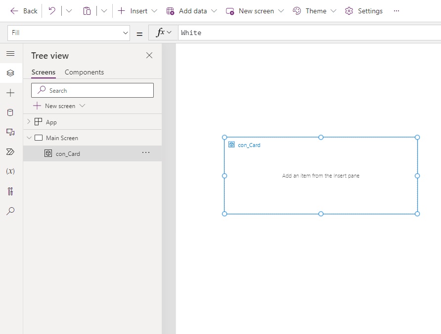
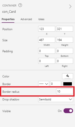
Select a drop shadow weight from the right-side menu. In this example we will choose a semi-bold drop shadow.
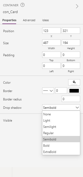
The container control now has a shadow around its border.
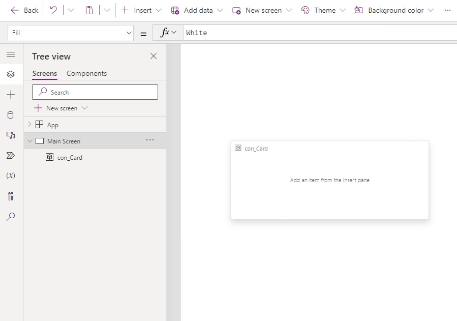
Round Container Drop Shadow Corners Using Border Radius
A drop shadow can be rounded by changing the border radius property of the container.
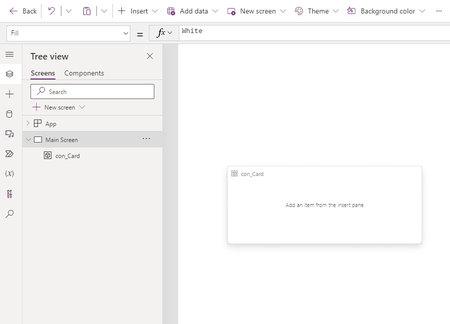
While selected on the container change its Border Radius property to 10 pixels.
Add Controls To The Drop Shadow Container
Once the container with a drop shadow is setup we can place some more controls inside of it to make a card.
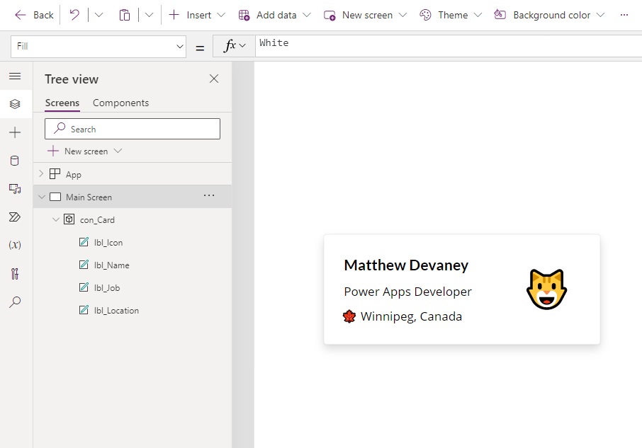
The Font and Size properties for the title of the card above are:
Font: Font.'Lato Black'
Size: 20Code language: HTTP (http)
And the Font and Size properties for the body of the card are:
Font: Font.'Open Sans'
Size: 16Code language: HTTP (http)
The emojis were created by inserting a label onto the screen and pressing the [Windows] + [Period] hotkey on a Windows computer.
Did You Enjoy This Article? 😺
Subscribe to get new Copilot Studio articles sent to your inbox each week for FREE
Questions?
If you have any questions or feedback about Ridiculously Simple Power Apps Drop Shadow Technique please leave a message in the comments section below. You can post using your email address and are not required to create an account to join the discussion.






hoowwwww. Finaly! Goodbye HTML + CCS style.
Thanks Matthew
Daniel,
Hahaha. Yes, goodbye to CSS.
Remember to add what version of PowerApps you need to be running. I think it’s not the current one. Maybe I missed that part when browsing through the article.
Thank You Matthew 😊
Bijumon,
You’re welcome 🙂
FINALLY!!! I have a great shadow box component that I’ve been using, but this is SO much easier and cleaner.
Steph,
I know, right? So much easier!!!
This is awesome. I can’t believe I missed this when I looked at containers. Thanks MD
It’s awesome. Drop it inside a gallery and your gallery cards are done! Thanks Matthew.
I love that Microsoft dropped this right under our noses! Love this feature!
Going to make galleries and displays way easier than using a Button, and a container and building on that!
Thanks for showing it off Matthew
T Marks,
I would welcome this feature directly on Forms & Galleries as well!
hi, any thoughts on how to deal with onSelect of the components within the container? They cannot find the parent anymore
Antbro,
Suggest you place a transparent button over top of the card and target the gallery’s OnSelect property from there.
Quick tip… you can drop a Form in a container to create forms with rounded corners even easier than before (previously required a Text Input with rounded corners inside of a container to achieve).
Is there a way to apply a hover effect to the Container shadow, i.e. it changes from Semilight to Bold on hover?
David,
No, containers do not have an OnHover feature.
Is there any way to change the Drop shadow to bold on hover of the container?
Aswani,
Hover effects aren’t available for containers unfortunately.